Overview
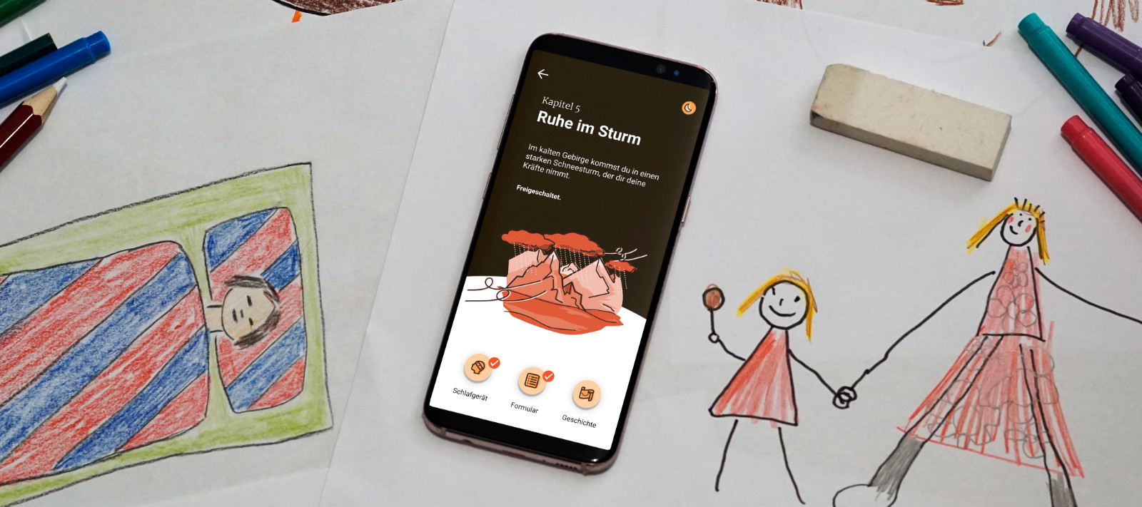
In a sleep treatment that aims at improving the quality of sleep, children lose interest as the therapy proceeds. The companion app Journey to Recovery helps children use the sleep device with Augmented Reality and keeps them engaged by means of a captivating and informative story.
Challenge
Children prematurely abandon their sleep treatment due to its monotonous tasks and the sleep device's complex usability.
Solution
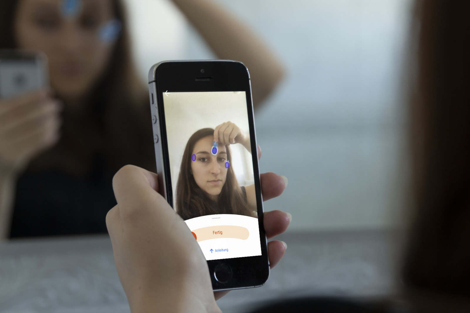
A companion app with which children can unlock a narrative and educational chapter every evening. With the help of Augmented Reality children are guided in using the sleep device correctly.
Background
In 2020, the research team SleepLoop were developing a sleep therapy for children (8–12 years) suffering from a concussion. They observed that their patients were prematurely abandoning their treatment, causing an interruption to the child's full recovery and the team's research.
Within the framework of our BA project, my co-designer Randy Chen and I set out to tackle SleepLoop’s challenge, aiming at improving the adherance in children.
Awards
Journey to Recovery won three awards for its "outstanding process, innovation and design" and was nominated for the UX Design Award 2021.
Press
Exhibitions & Talks
User Research
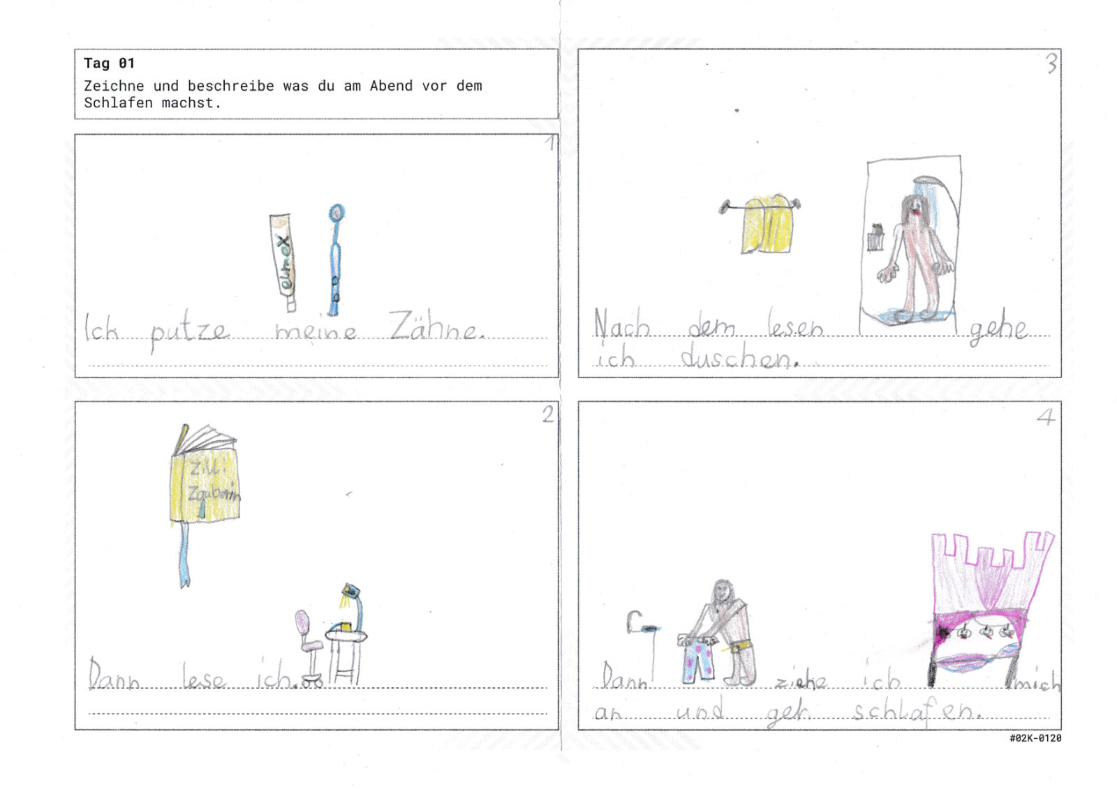
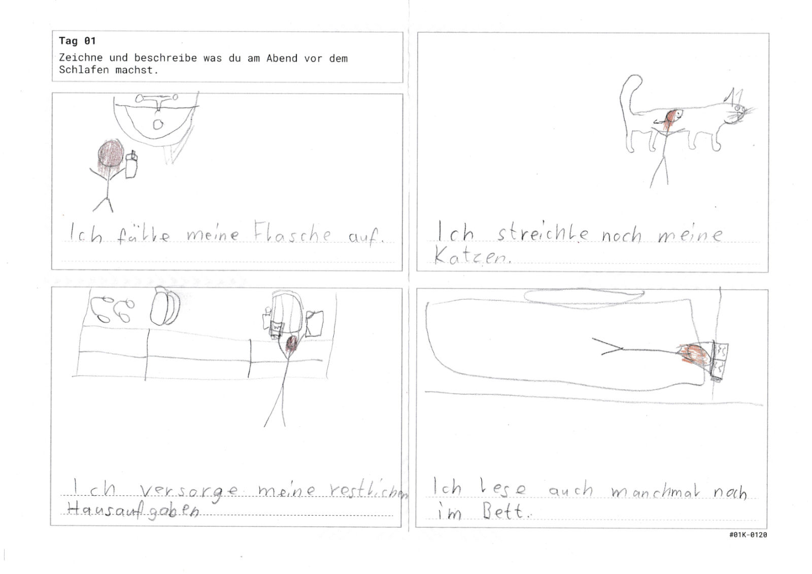
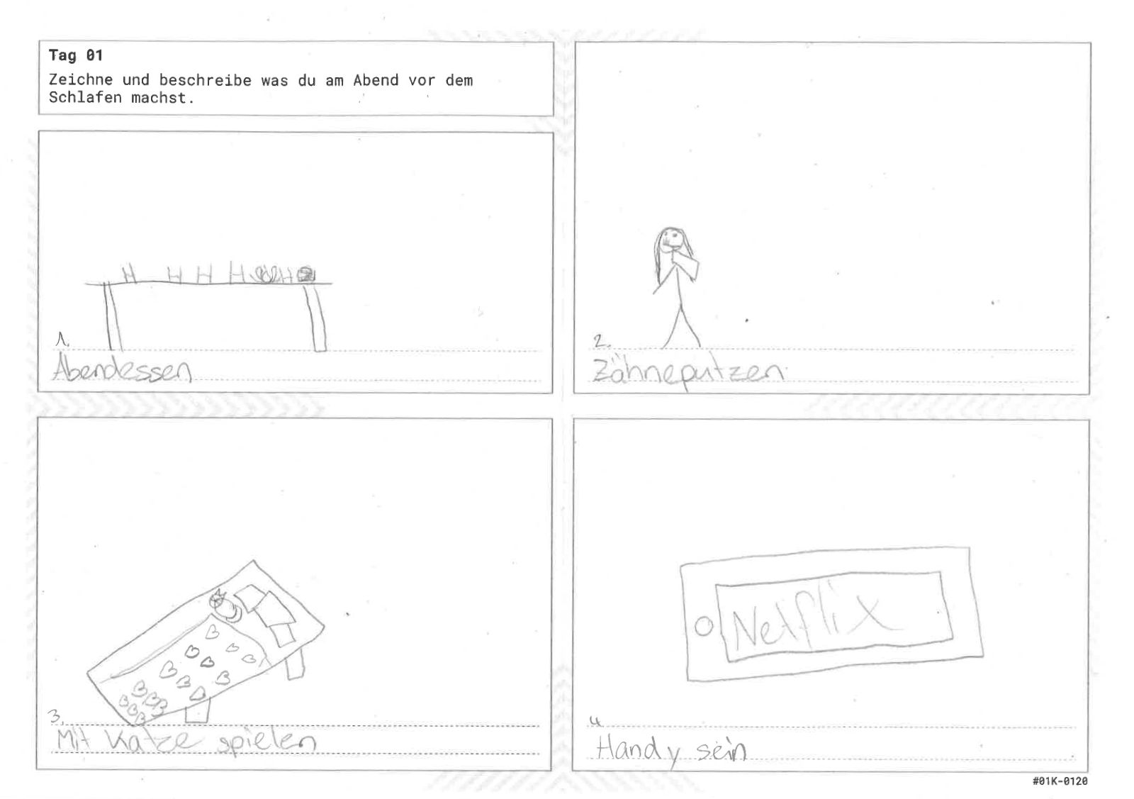
Classroom Workshops & Cultural Probes
Through classroom visits, workshops and cultural probes with children aged between 8 and 17 years, we investigated the bedtime behaviour, interests and disinterests of our target audience.
Key Insights
- Children enjoy consuming entertainment before going to sleep, in the form of books, videos or games
- Stories had a substantial importance in their bedtime routine
Bodystorming
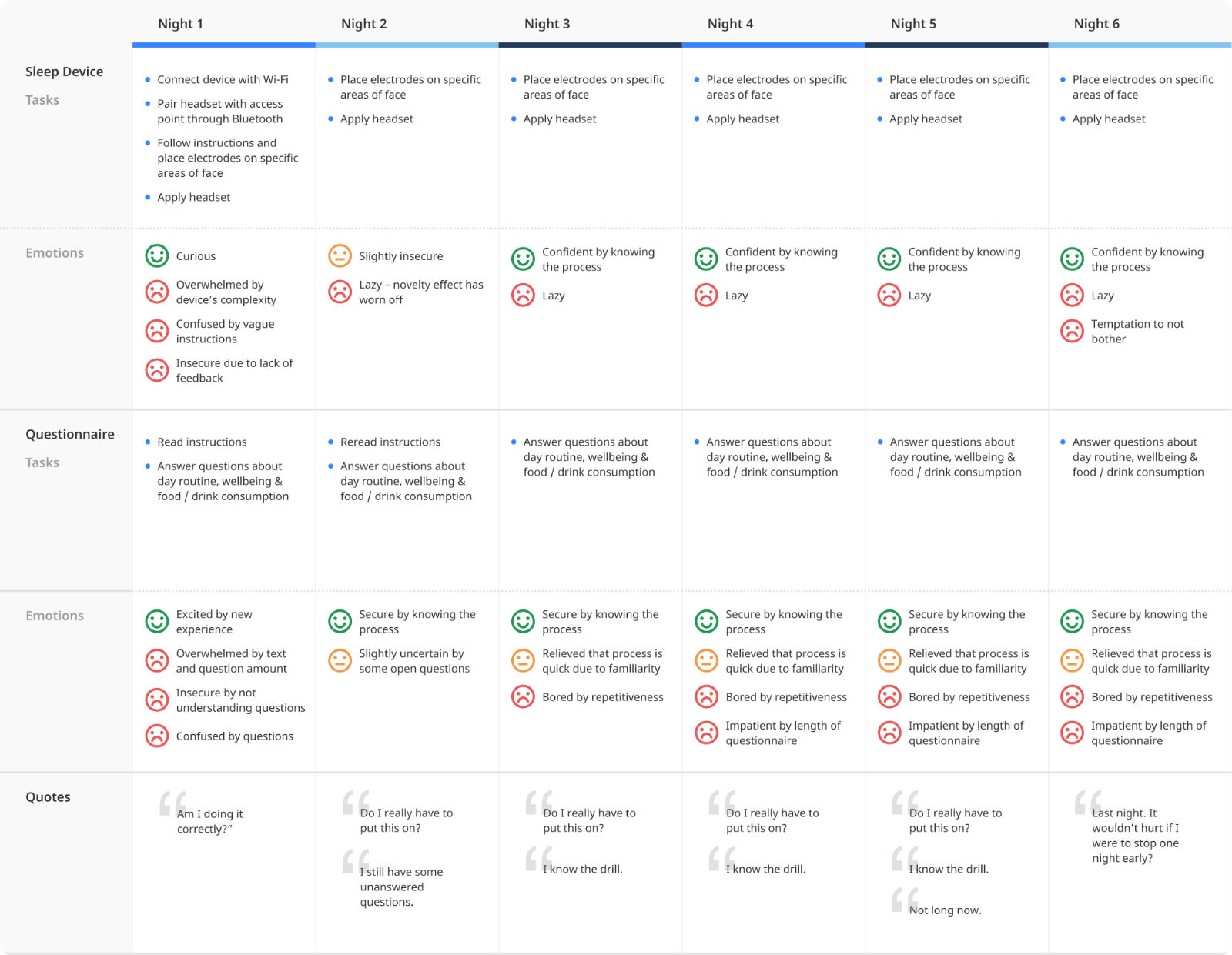
To fully empathise with the sleep patients, we tested and experienced the medical sleep device for ourselves at home.
Key Insights
- The device's instructions were confusing to understand
- Not knowing where exactly to place the electrodes caused uncertainty
- No feedback was provided in the morning to indicate whether the sleep had been successfully tracked or not
- Therapy became boring over time, due to length and repetitiveness
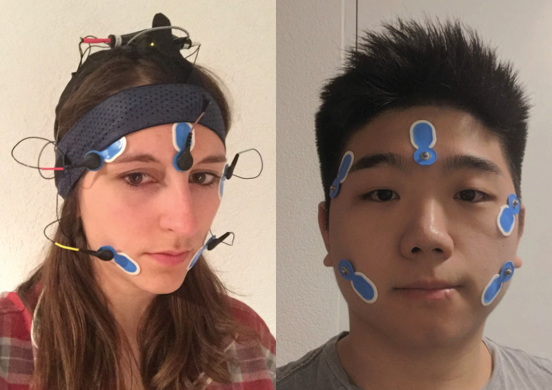
Our experienced emotions and pain points were documented in a Emotion Journey Map.
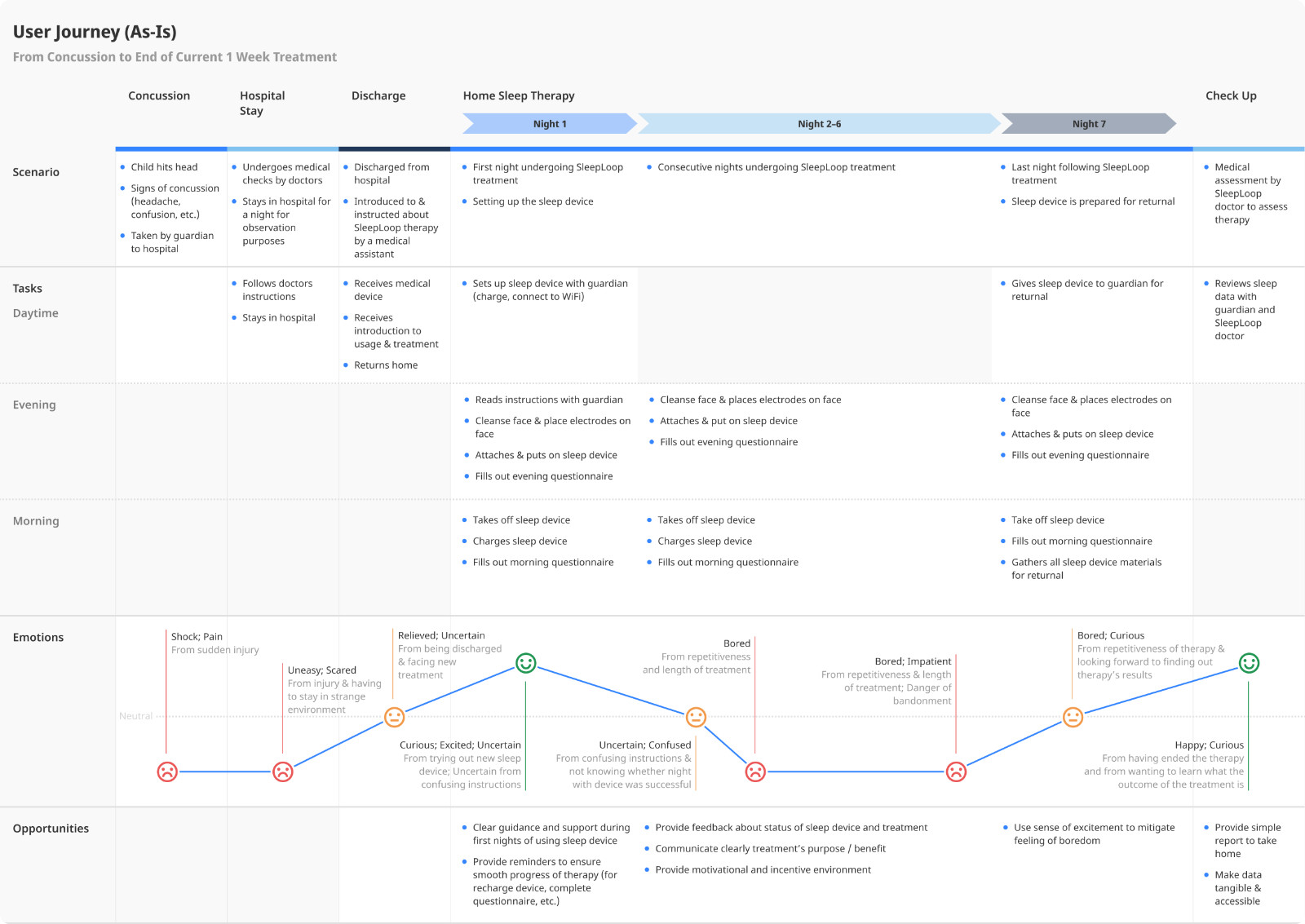
User Journey (As-Is)
Together with SleepLoop, we analysed and documented the "As-Is" user journey of the sleep treatment.
Doing this collaboratively helped us establish a mutual understanding of the experience and the child's journey to recovery.
User Interviews
Due to privacy protection, we were not able to get in contact with the current patients. Instead we interviewed children, their parents and teachers to learn more about the general behaviour and interests of our target audience.
Key Insights
- Parents often resort to rewards to encourage compliance in their children
- Children (especially aged 10 and older) react more positively towards adult designs than childish designs
- Any form of technology (e.g. tablets and phones) always catches children's attention and causes for excitement
Ideation
From our research we recognised that our solution should not interfere strongly with a child's bedtime behaviour and that there existed many insecurities when it came to the device's application and the progress of the sleep treatment.
This led us to develop the following question:
How Might We...
help children use a medical wearable properly at home and create a positive experience that motivates, entertains and informs children throughout their treatment?
Ideation Workshop with Sleep Experts
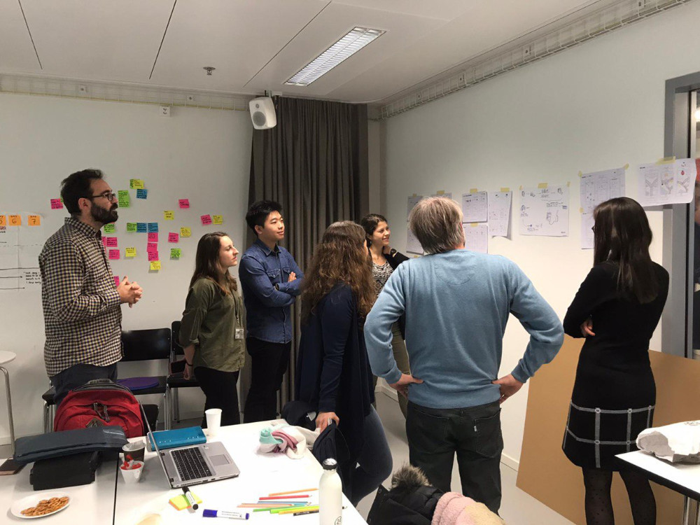
To profit from the expertise of sleep researchers and paediatricians we organised an ideation workshop with our partner SleepLoop. After sharing our research, we sketched out ideas and collaboratively developed a solution.
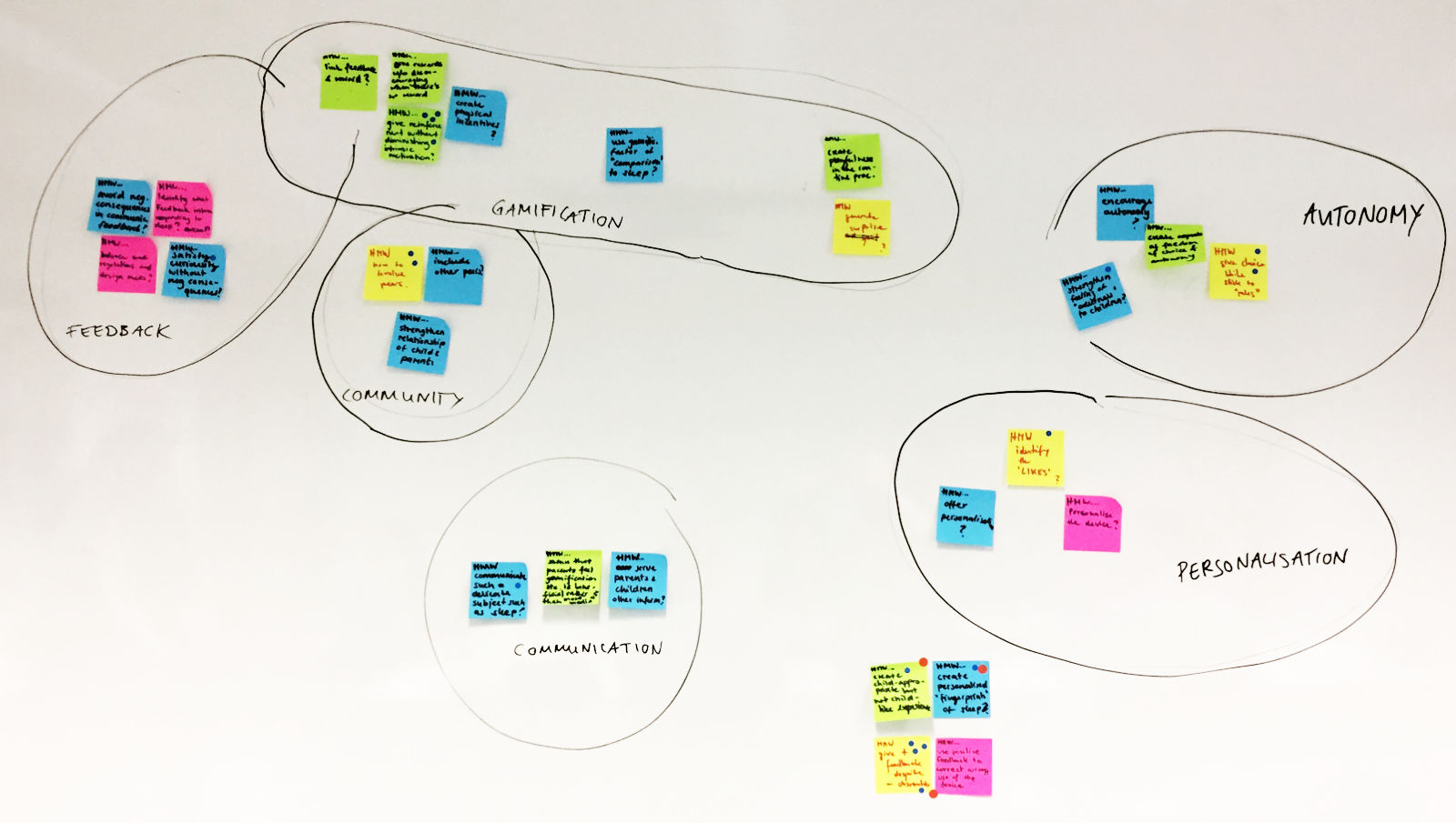
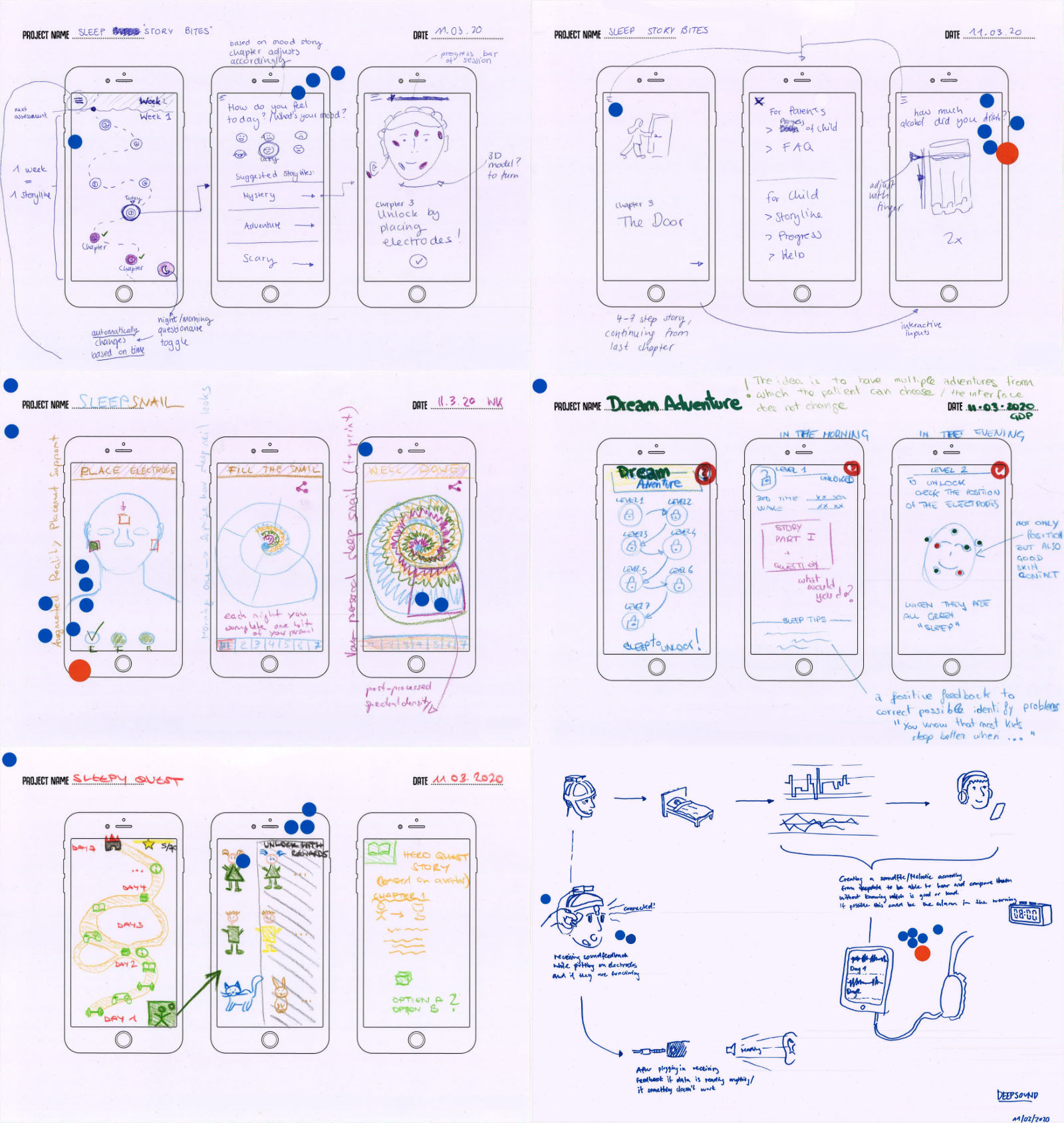
The insights from our research – the enjoyment of bedtime stories and the uncertainty towards the device's correct usage – influenced our ideation session. Through Crazy 8's we created ideas; through dot voting we identified and collaboratively agreed upon the key solutions.
Ideated Solutions
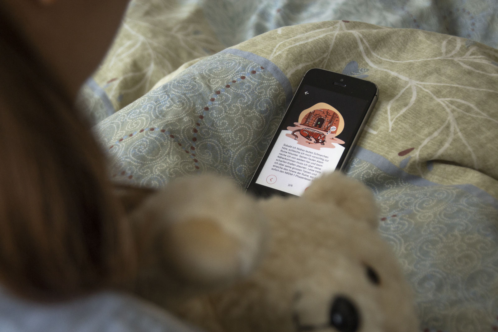
- Stories as a form of unpredictable, variable rewards:
Wanting to know what happens next in the story would spur the children on to continue their treatment - Unlock a story chapter after putting on the sleep device:
The sleep treatment would become a journey on which the children would embark each evening - Augmented Reality to provide instant visual feedback:
Guidance through Augmented Reality would allow children to instantly see whether the electrodes had been placed correctly on their face
Storytelling Workshops with Children
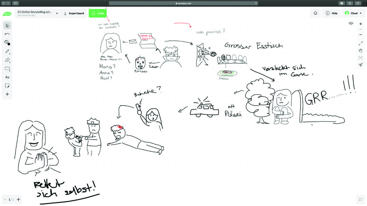
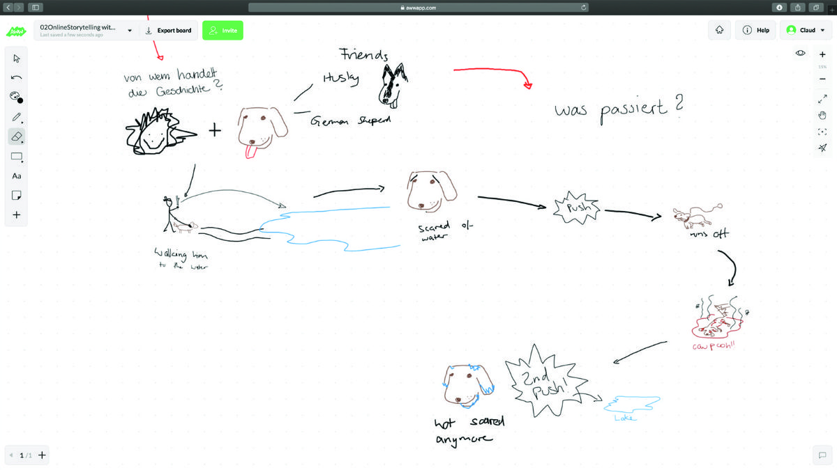
In co-creation workshops, we gave children the opportunity to shape their own storylines and experience. Thereafter, we discussed the themes of their stories with sleep experts to assess whether they were suitable for our sleep context.
Key Insights
- Children find bizarre plots the most humourous and enjoyable
- Absurd stories were feared to impair the seriousness towards the treatment – for this reason the results served solely for inspiration
- We decided against the integration of the sleeping device into the story, as we felt it unwise to turn a medical device into a toy
Design
To us it was important that the app’s design was child appropriate, but not childish. The seriousness and the trustworthiness of the treatment should also come across, without making it appear too boring or reserved.
Information Architecture
Having decided on the core features, we continued with the app's information architecture. The chapter selection quickly became the app's structural heart: it is from here where patients can quickly access the content and features to their treatment.

This home screen would not only support a quick and easy access to the most current chapter, it would also provide the patients an overview over their completed and upcoming chapters.
User Flow
Alongside the visual sitemap, the user flow helped us to figure out how the patients would interact with the product.
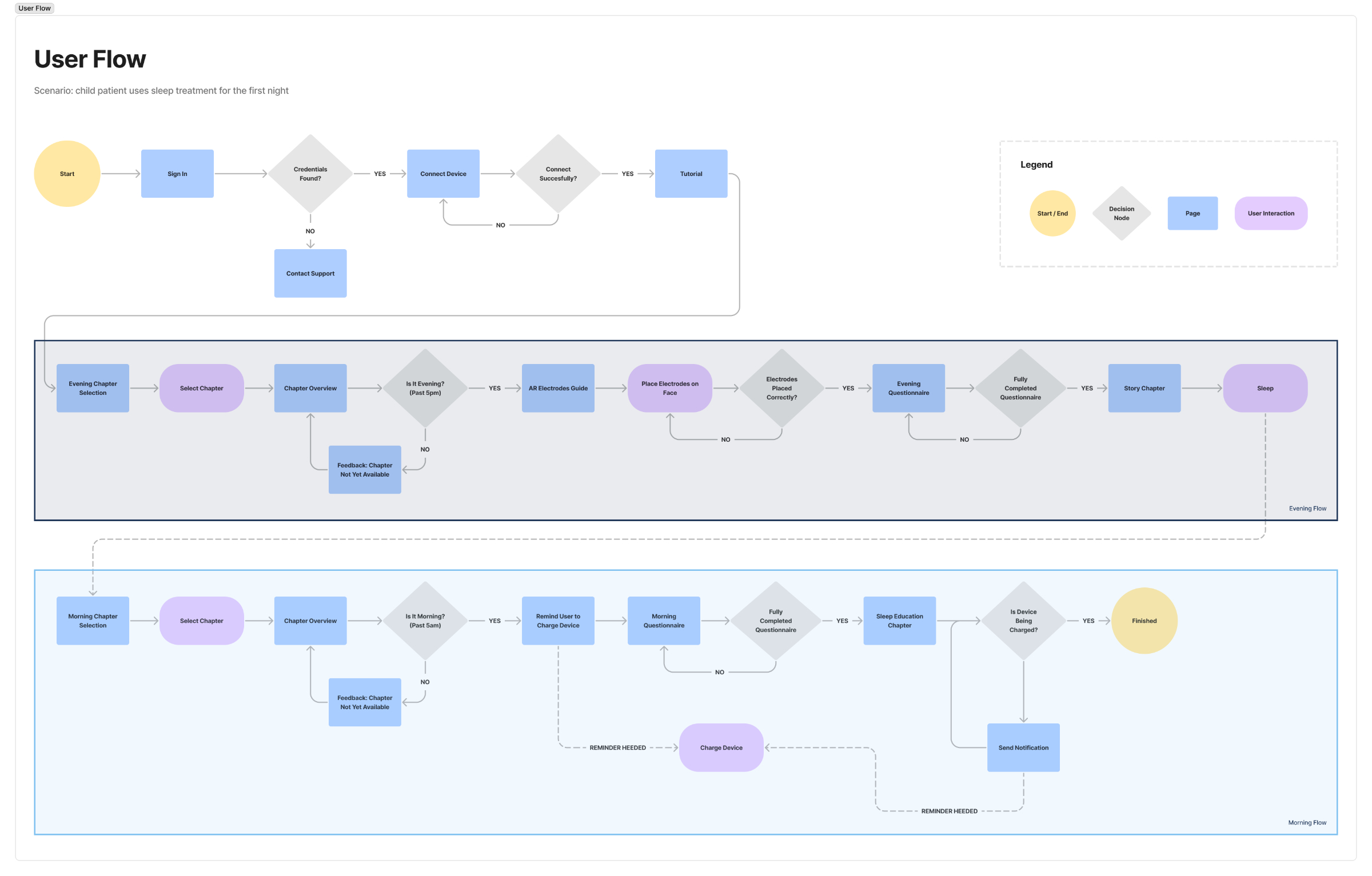
It helped us recognise how important it was to clearly differentiate between the app's night and morning content.
Wireframe & Design Iterations
Low-fi wireframes and an interactive prototype helped us to identify missing content and unanswered questions.
The chapter selection screen - our home screen - became our biggest focus. We iteratively searched for the most intuitive solution to visually communicate the correlation between the evening and morning chapters.
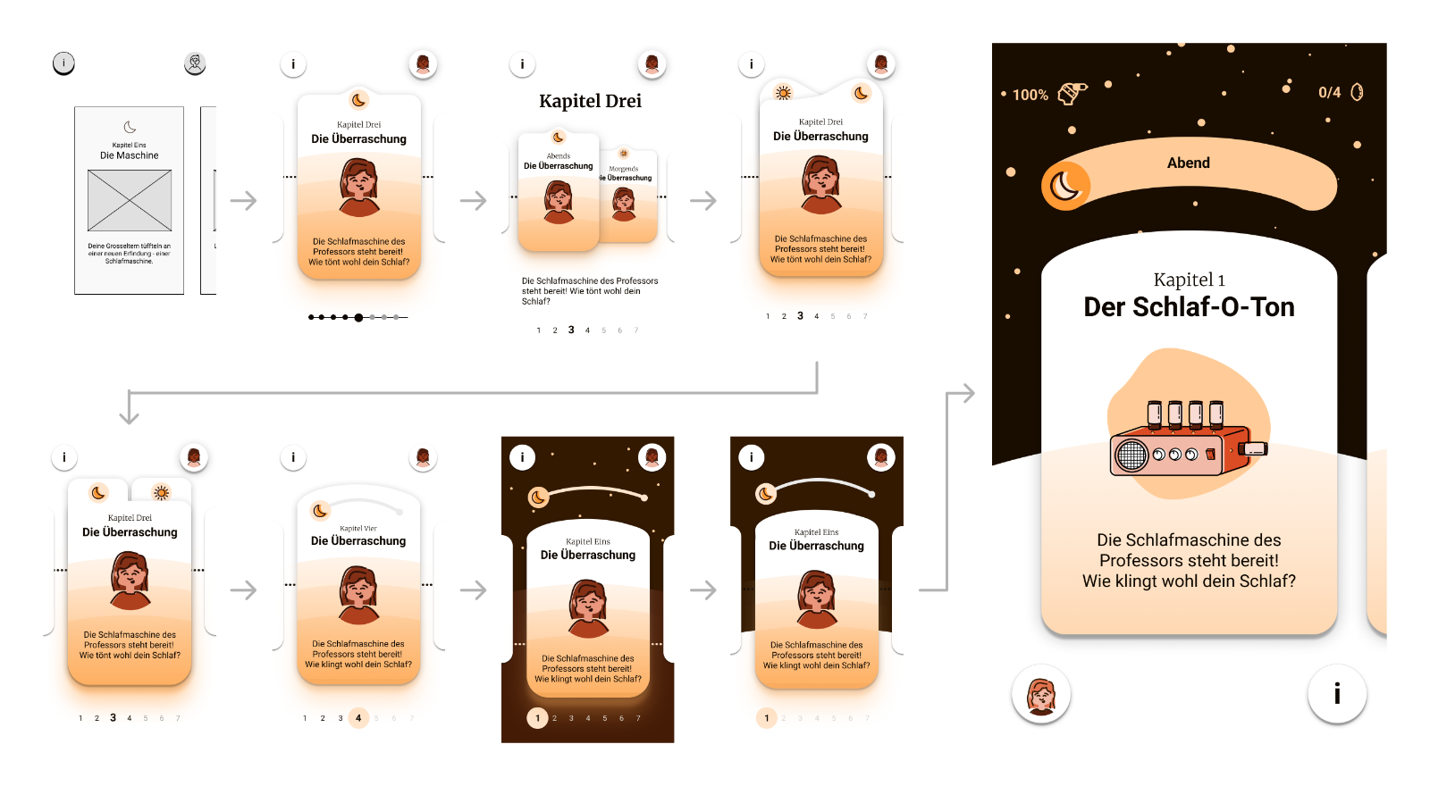
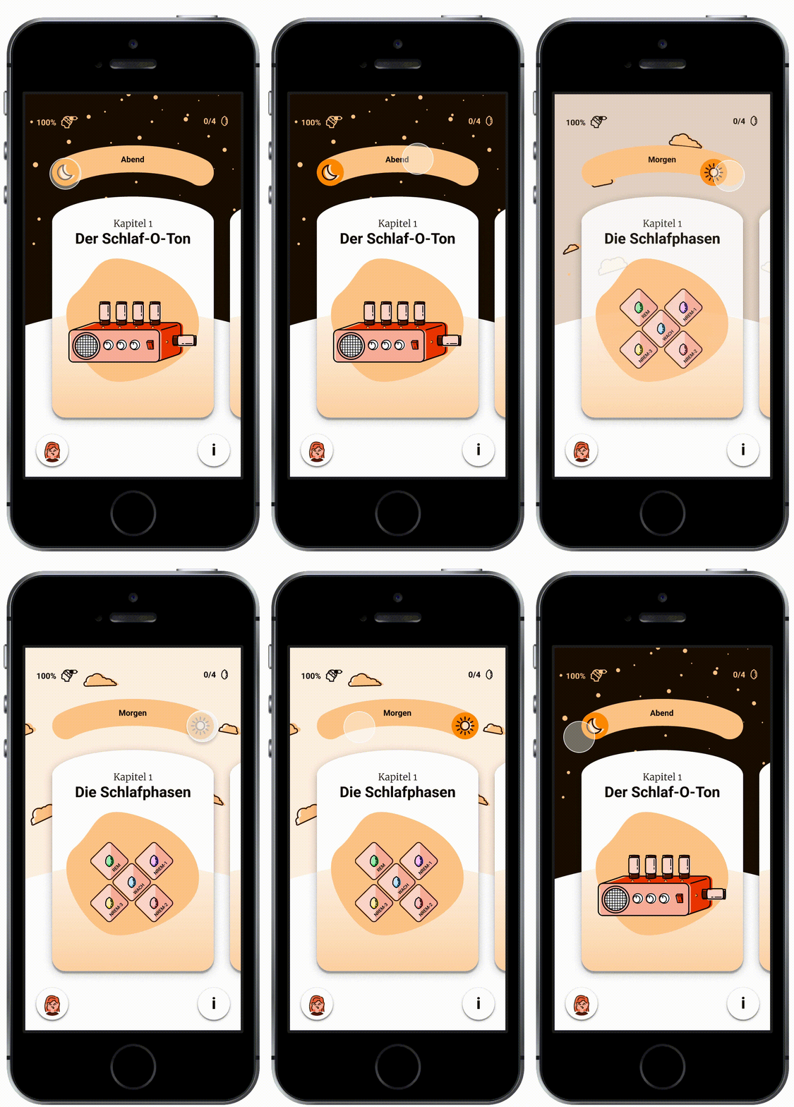
Inspiration ultimately came from the sun and moon's celestial path: by moving these celestial bodies across the sky the user could switch between the morning or the evening chapter of the treatment. With this mental model we designed an interaction whose playfulness was approprate for our target audience.
Colour Styles
Studies indicate that a screen's blue light affects our ability to fall asleep. With this in mind we decided to rely on an orange-based colour palette as this wavelength mitigates this effect.
Specifically for the illustrations a colour palette was created in accordance with the primary and secondary colours.
Primary Colour
Primary
#EC4713
100
#2C1007
200
#58200E
300
#843015
400
#AF401D
500
#DB5024
600
#E27350
700
#E9967C
800
#F1B9A7
900
#F8DCD3
Secondary Colour
Secondary
#FC7E01
100
#331900
200
#663300
300
#984C01
400
#B25901
500
#CB6601
600
#FF9933
700
#FEB267
800
#FFCC99
900
#FFE5CC
Neutral Colours
Black
#0D0700
Gray
#CFCFCF
White
#FFFFFF
Final Storyline
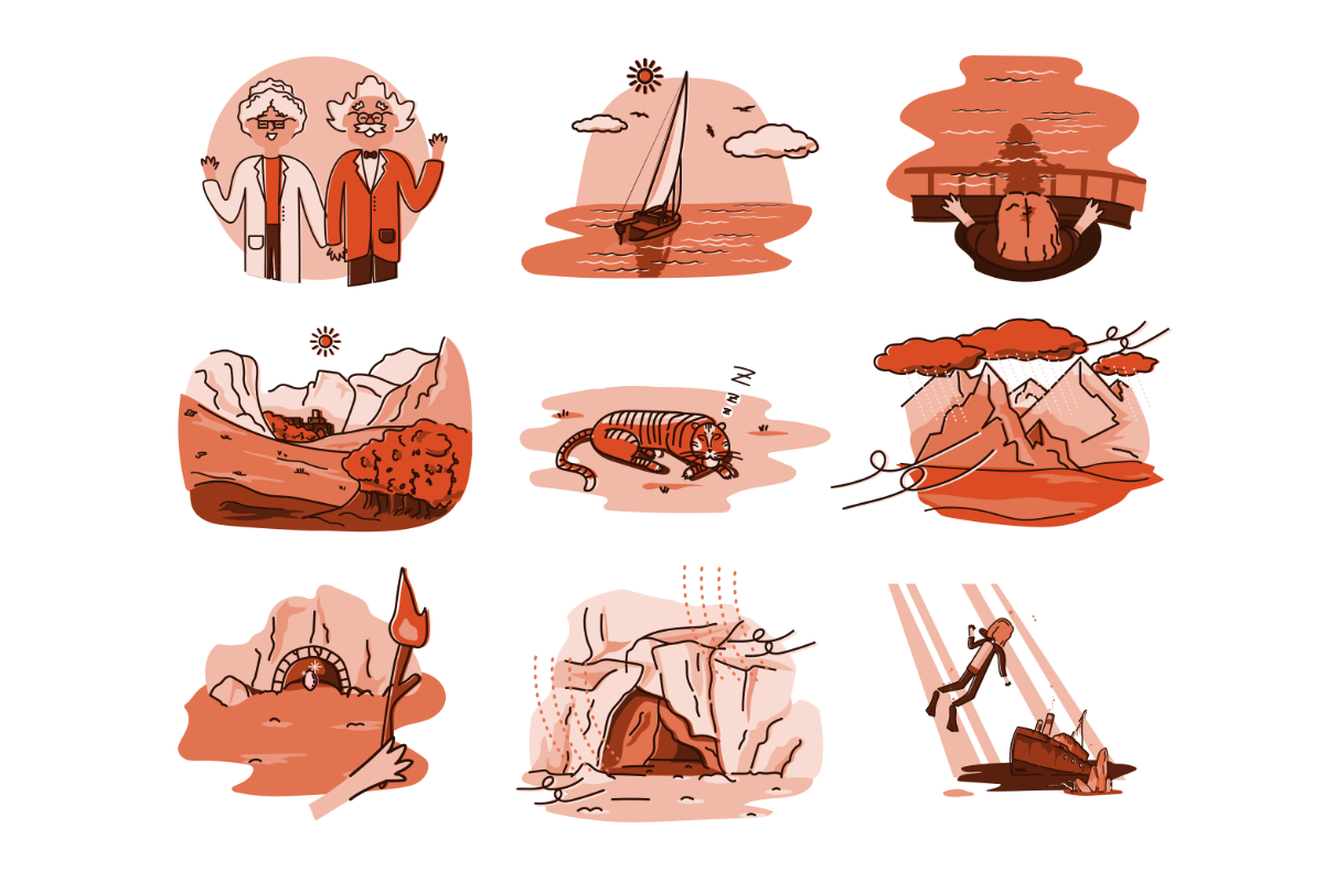
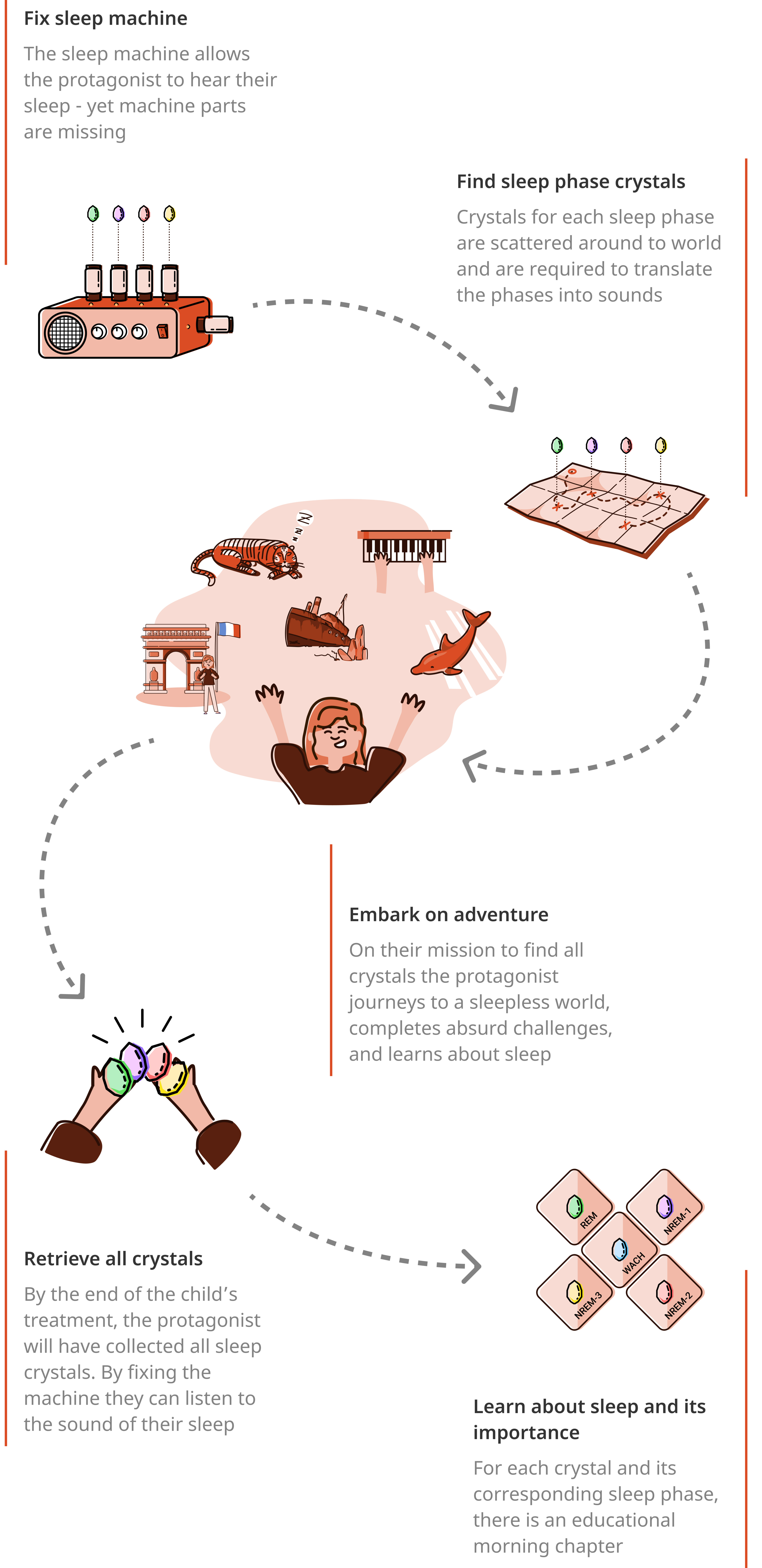
The children's imagination and inputs from the previous storytelling workshop provided us with a lot of inspiration from which we created a final storyline.
We took care to make the narration not too scary or childish. It was our creative decision to have the final content reflect the context of sleep. This way would could encourage sleep education as part of the treatment.
Augmented Reality
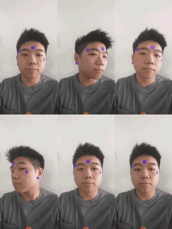
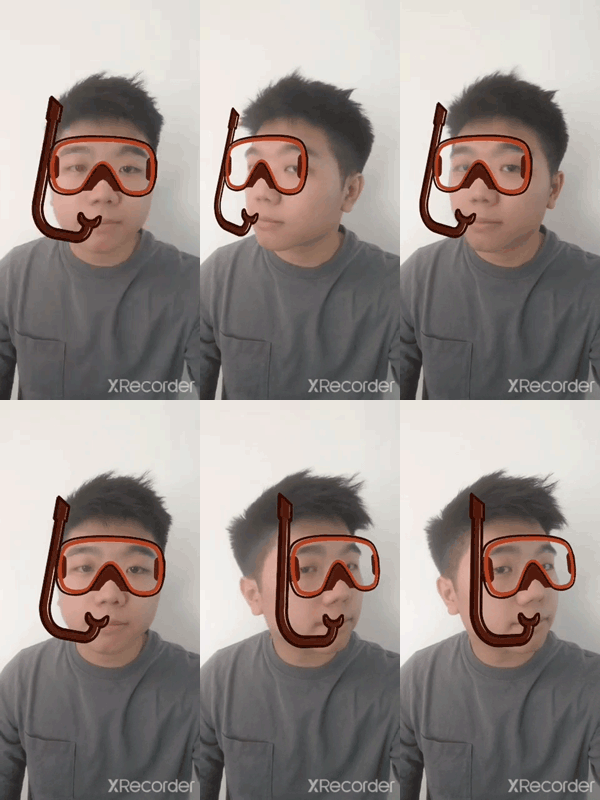
With Augmented Reality (AR), our goal was to provide instant feedback to the user as to where to place the electrodes in order to correctly put on the sleep device. The prototype showcased the potential of AR, yet also its limitations – for example behind the ear.
Beyond its instructoral usage, we investigated its application within the story in order to create a more immersive experience. To progress, children would have to therefore choose a costume, allowing them to trick a tiger or dive underwater.
Usability Tests
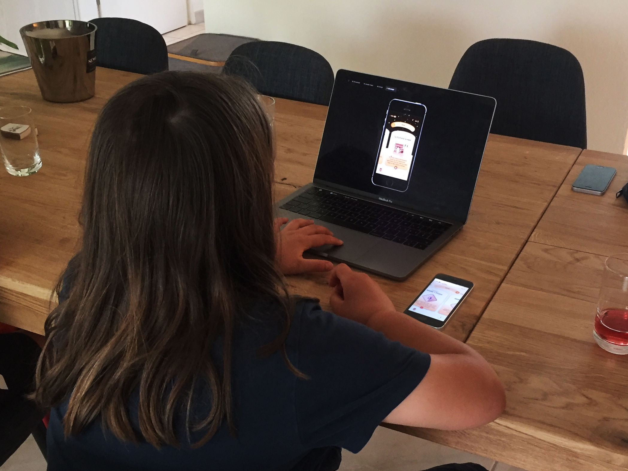
A usability test was conducted with children aged between 8 and 10 once the entire story had been written and illustrated, and the screens had been designed and prototyped. Our goal was to validate our concept and designs.
Key Insights
- 100% of testers understood the home screen's evening / morning toggle interaction, describing it as "fun"
- 100% of testers ignored the teaser text on the home screen and focused mostly on the images. This led to the removal of the texts and the enlarging of illustrations in a second iteration
- 50% of testers expressed that they would prefer to listen to the story as an audiobook as they are not avid readers
Conclusion
Journey to Recovery was an enriching design journey for myself. I learnt a lot, from strengthening my co-creation methodologies to circumventing the risk of bias when working with children. Above all, this project gave me more confidence as a interaction designer.
The project serves as a foundation from which several developments and investigations could be pursued in future: what if we were to combine a medical therapy with the services of Netflix or Audible, offering patients entertainment while adhering to their doctor’s advice? How could we display instructions interactively and intuitively using AR?
Design within a medical field still offers great, unexplored possibilities. Especially after the COVID-19 pandemic, people are beginning to recognise the importance of user-friendly, (digital) experiences within our heath services.
As such, Journey to Recovery caught the attention of designers across the world: not only was it referenced in various design magazines, it also won three awards for its "outstanding process, innovation and design" and was nominated for the UX Design Award 2021.
The full BA thesis can be found here.
