Process
Overview
The Zurich City Guide app provides tourists of Zurich information on museums, restaurants and attractions. With the purpose of making the visiting experience more personal and convenient, new features were introduced with a focus on planing and managing a visit to Zurich directly from one app.
Challenge
Zurich Tourismus aimed at expanding their app as the digital guide and point of sale for both tourists and locals of Zurich. This required the introduction of new features, as well as a redesign of the app's structure and navigation.
Solution
An integrated ticket shop allows tourists to conveniently purchase the Zurich Card, as well as admission tickets. By adding favourite locations to an itinerary, visitors can also plan their trip to Zurich. Resorting to common design patterns, the whole navigation and usability was redesigned.
Background
Late 2021, the creative agency Formatfrei took charge over the design of the existing Zurich City Guide app, alongside Binarium who became responsible for its development.
With Zurich Tourismus a close collaboration started with the goal to gradually evolve the Zurich City Guide app into a more convenient and practical digital city guide. To this day, the partnership and improvement efforts still continue.
My role within this project is to support the team as a UX / UI designer. I set up the app's design system in Figma, designed parts of the UI, advised as a UX consultant and co-facilitated the usability tests.
Links
Discover the Zurich City Guide App for yourself by downloading it for free:
Analysis
Before ideating and conceptualising any new features, we conducted a careful analysis of the existing app. This enabled us to thoroughly explore its features, usability and information architecture, while identifying areas for improvement.
Throughout our review, we returned to the following questions: "What needs remain unfulfilled?", "How can we enhance the overall experience?", and "Where can we place new features?"
Strengths
- Strong brand recognition:
The app's UI design strongly represented the brand of Zurich Tourismus. It was important to uphold this in future designs. - Fluid map:
The map provided a smooth and polished experience, characterised by its seamless touch interactions and instant response times.
Improvements
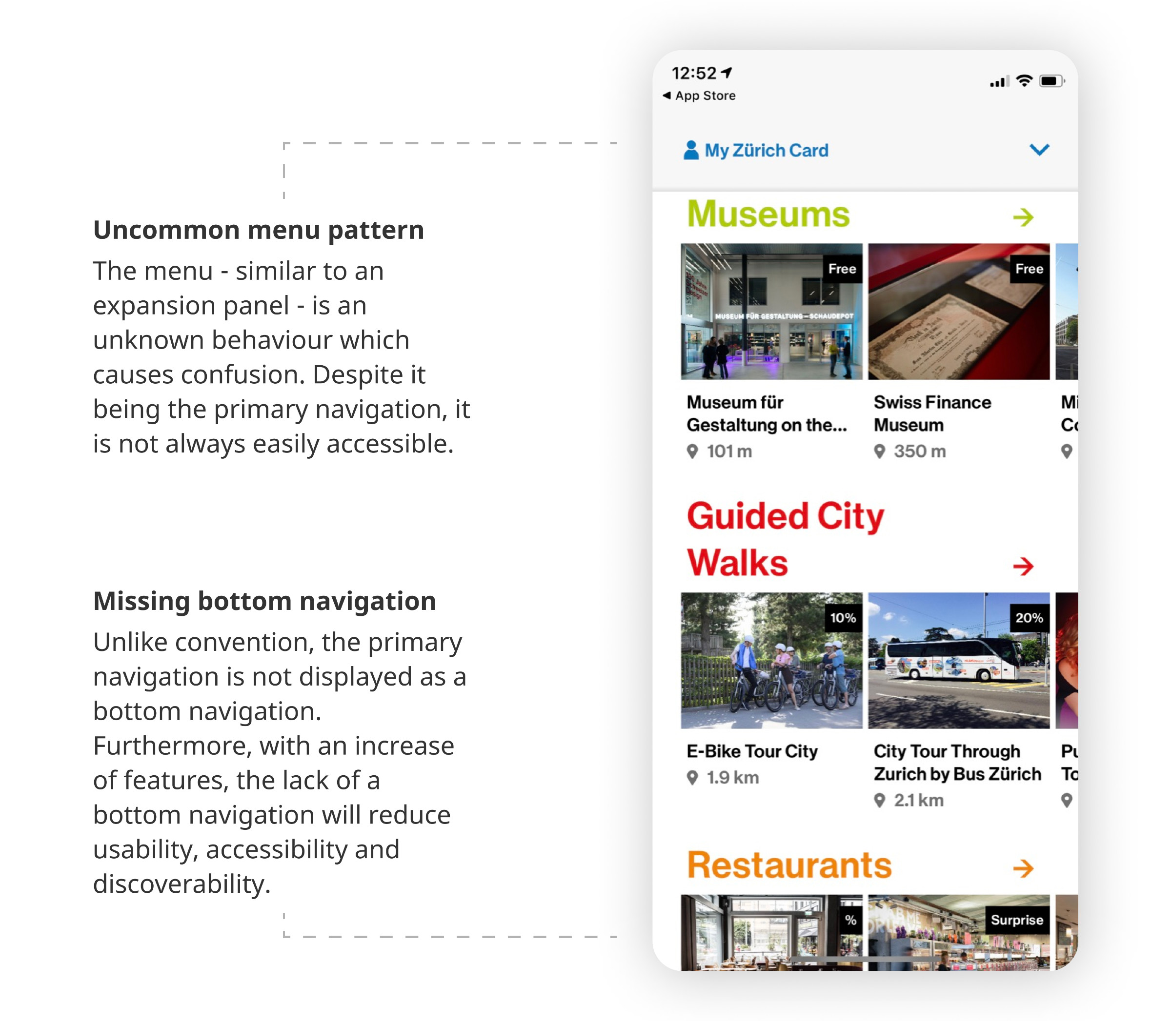
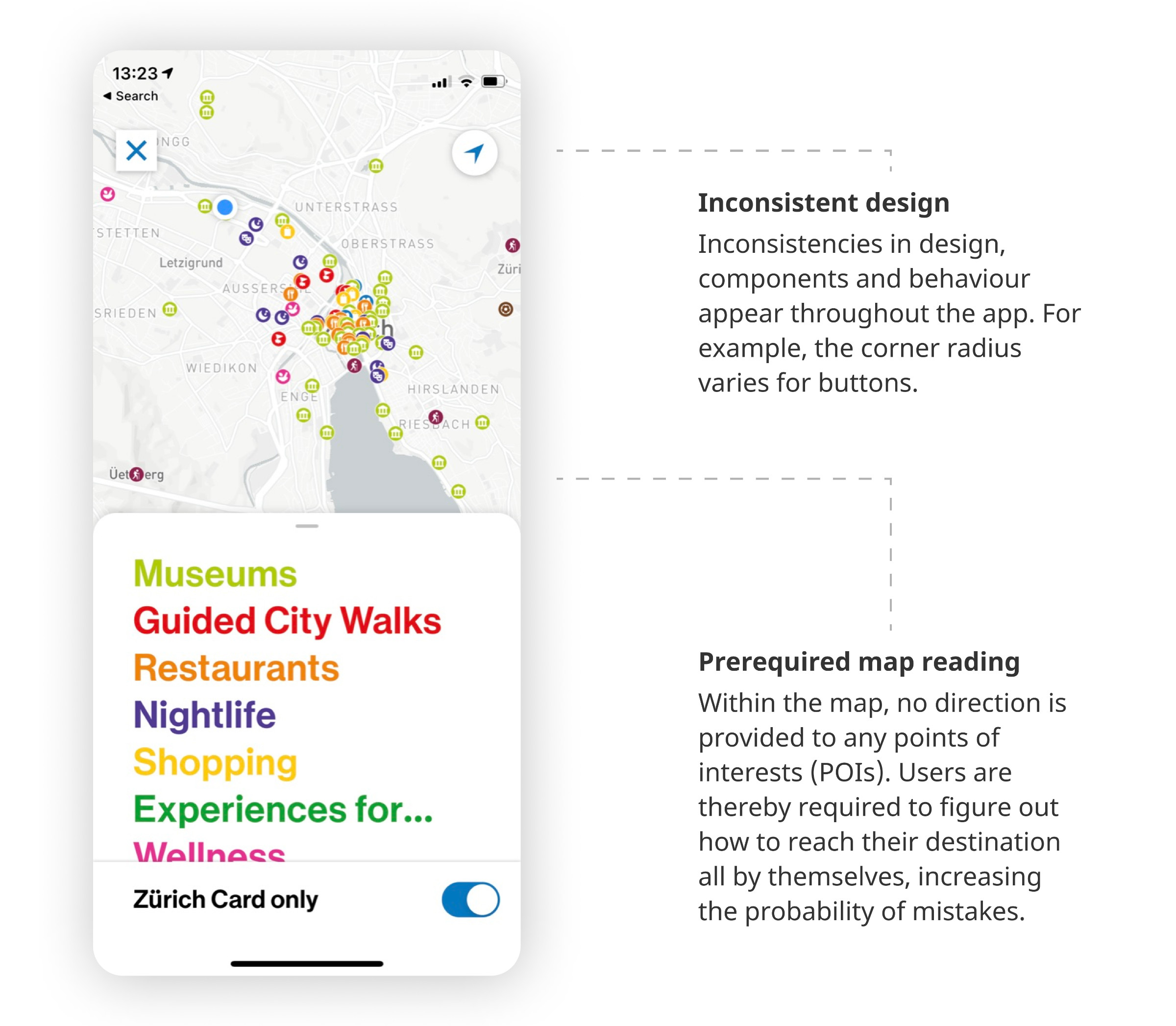
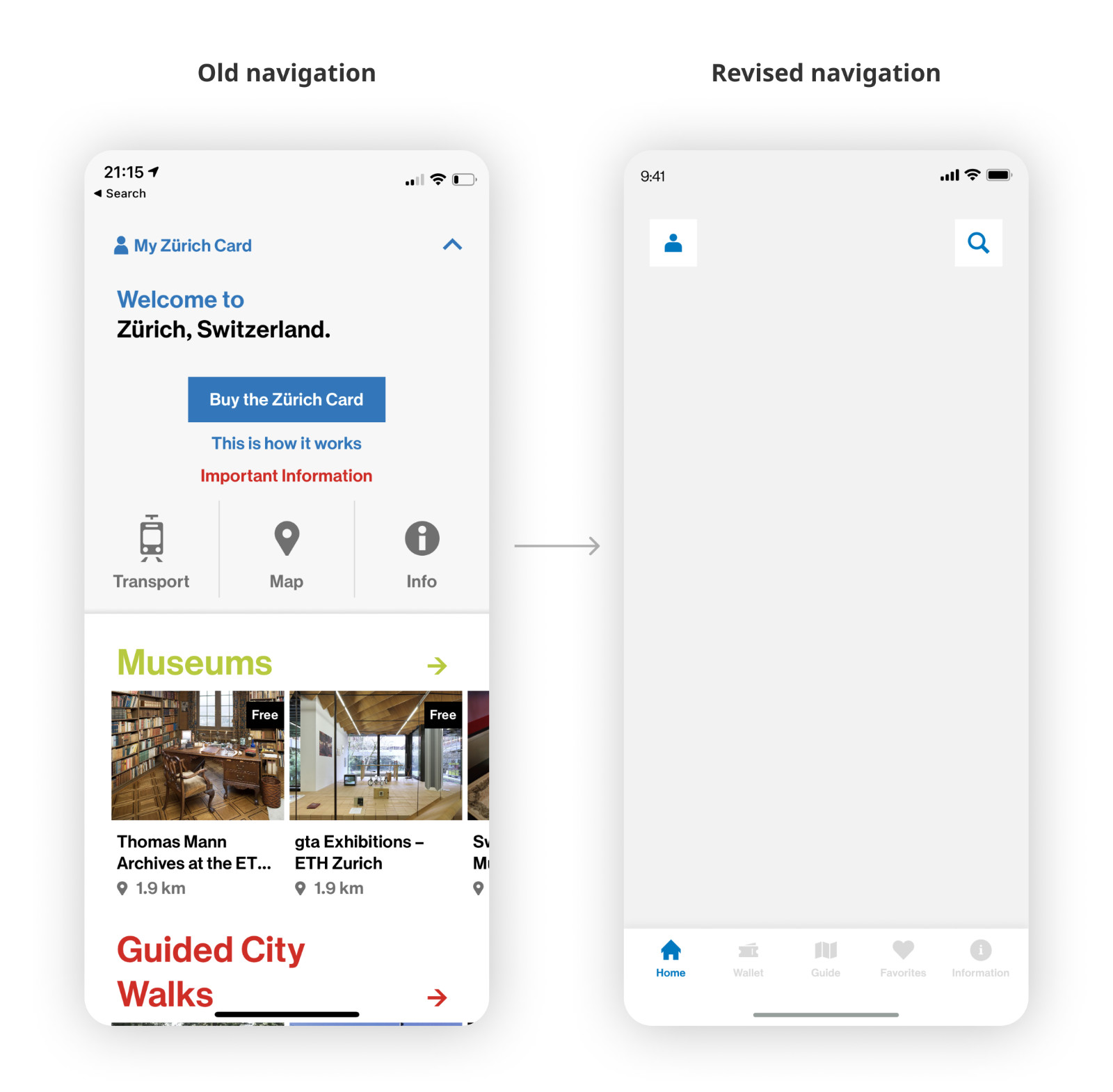
- Unconventional navigation patterns:
The app's overall navigation encompassed uncommon behaviours and interactions (i.e. an expansion panel as a menu). This made it confusing to orient oneself in the app. - Inconsistent components:
Throughout the app, UI and UX inconsistencies persisted: various components had visual (e.g. button corner radius) and behavioural (e.g. back button display) differences. - Prerequired map reading skills:
No directions were provided when selecting a location. Users had to figure out how to get there by themselves. Mistakes were thereby more likely to happen, resulting in a negative visiting experience.
Ideation
Our collaboration with Zurich Tourismus started with an online ideation workshop in which all relevant stakeholders shared their observations and the pain points gathered from customer feedback.
This led us to develop the following question:
How Might We...
promote sales of the "Zurich Card" product while creating a pleasant digital guide to Zurich that appeals to both tourists and locals?
Prioritisation & Planning
Having gathered the feedback, we collaboratively ideated new features and analysed the feasibility and impact of these ideas using the Impact Effort Prioritisation Matrix.
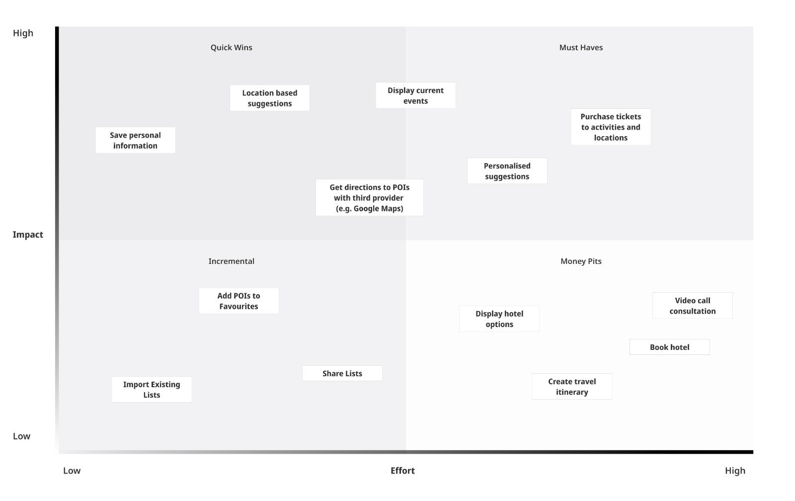
Our intention of accommodating the needs of both tourists and locals alike guided us in our decision making. In particular, we prioritised features which would turn the app into a more practical tool.
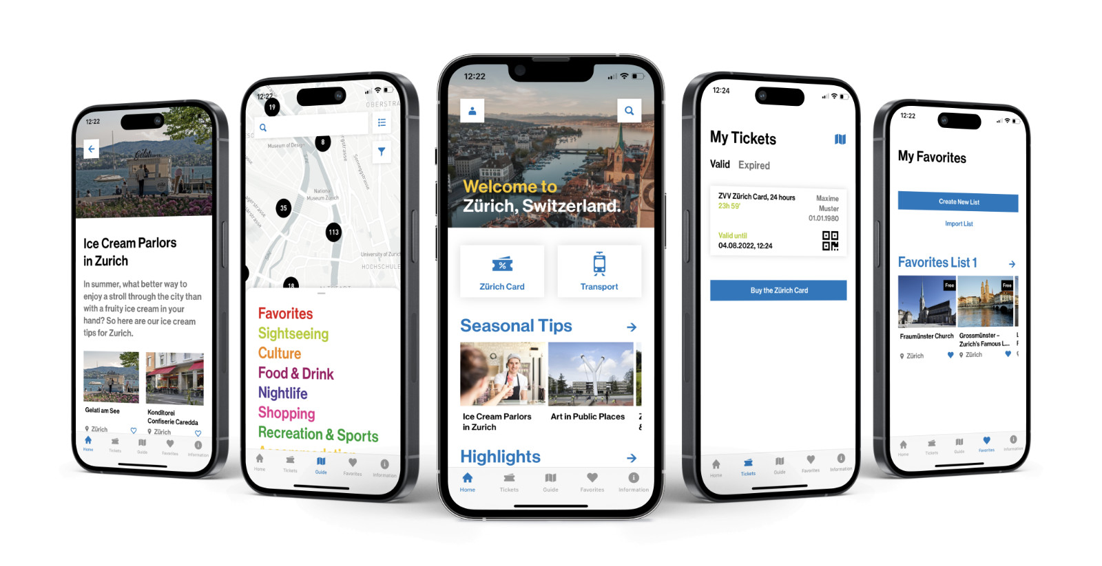
Key New Features
- Purchasing and managing the Zurich Card in the app
- Saving points of interests (POIs) as favourites and curating lists
- Sharing lists to other users (i.e. hotels and tours can curate their own itineraries)
- Viewing current events
- Purchasing entry tickets to museums, activities and tours
The previous analysis of these features enabled us to define a roadmap as to which features to tackle first in the next big release.
Design
Although Zurich Tourismus boasts a highly recognisable and visually appealing brand, the app's design suffered from unconventional and confusing patterns, largely due to the absence of a consistent component library.
Our primary objective in the design process was therefore twofold: enhancing the current UX and UI design while also optimising the component library and architecture.
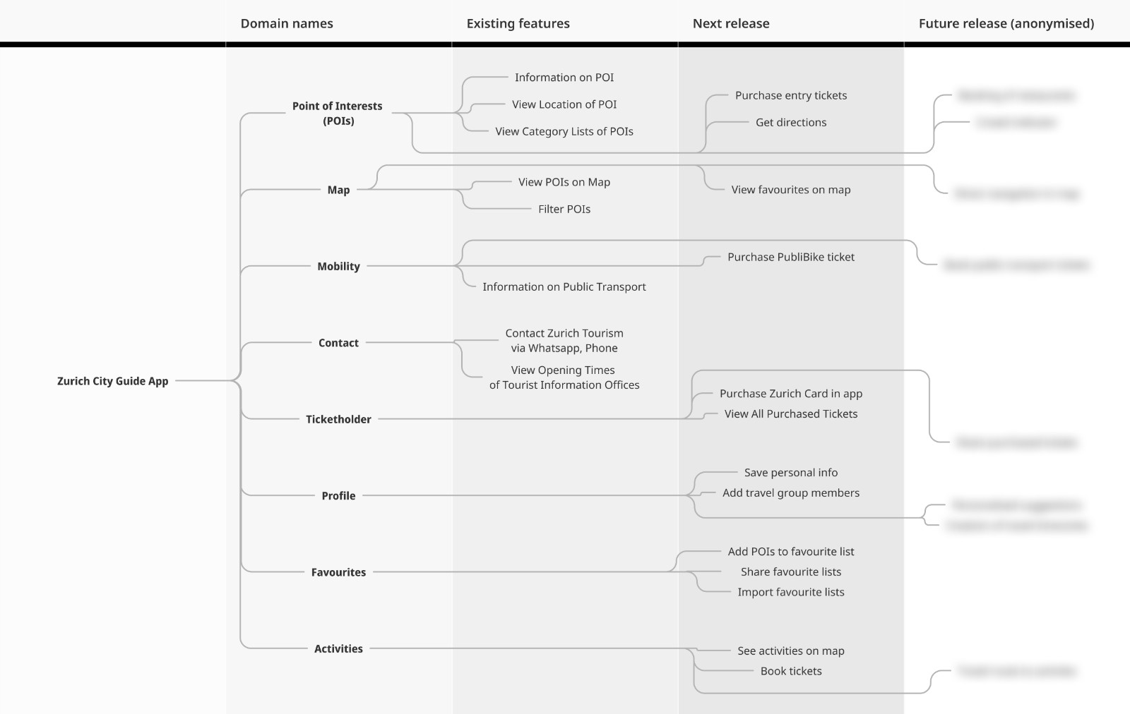
Information Architecture
The increase and restructure of content meant that the Information Architecture had to be revised. By doing so, we also had to take any future features into consideration which we had previously defined in the roadmap.
With the goal of strengthening the accessibility and discoverability, we focused on redesigning the primary navigation, placing key features at the top of the hierarchy.
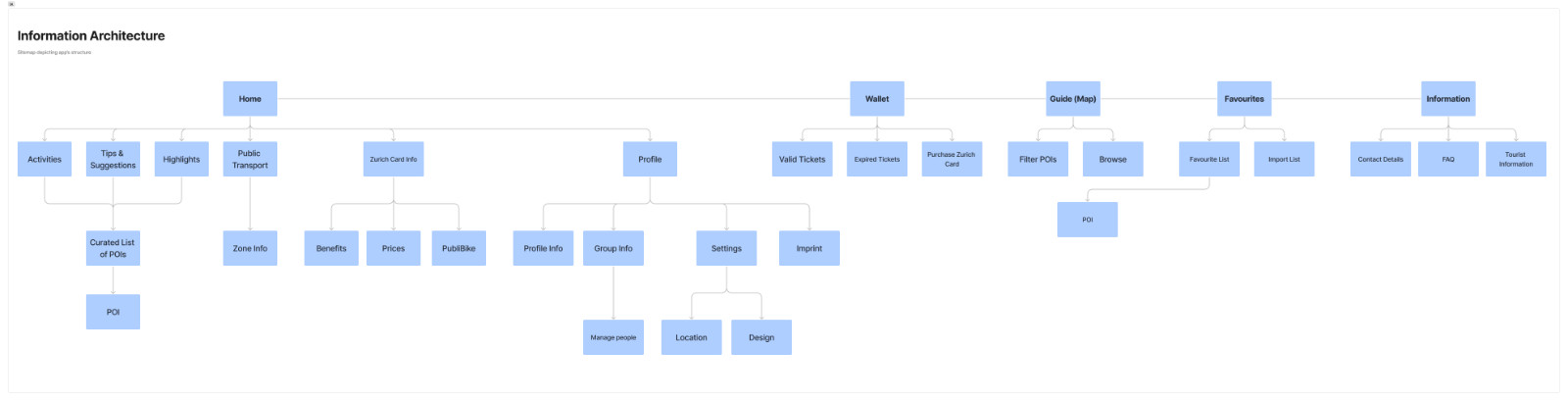
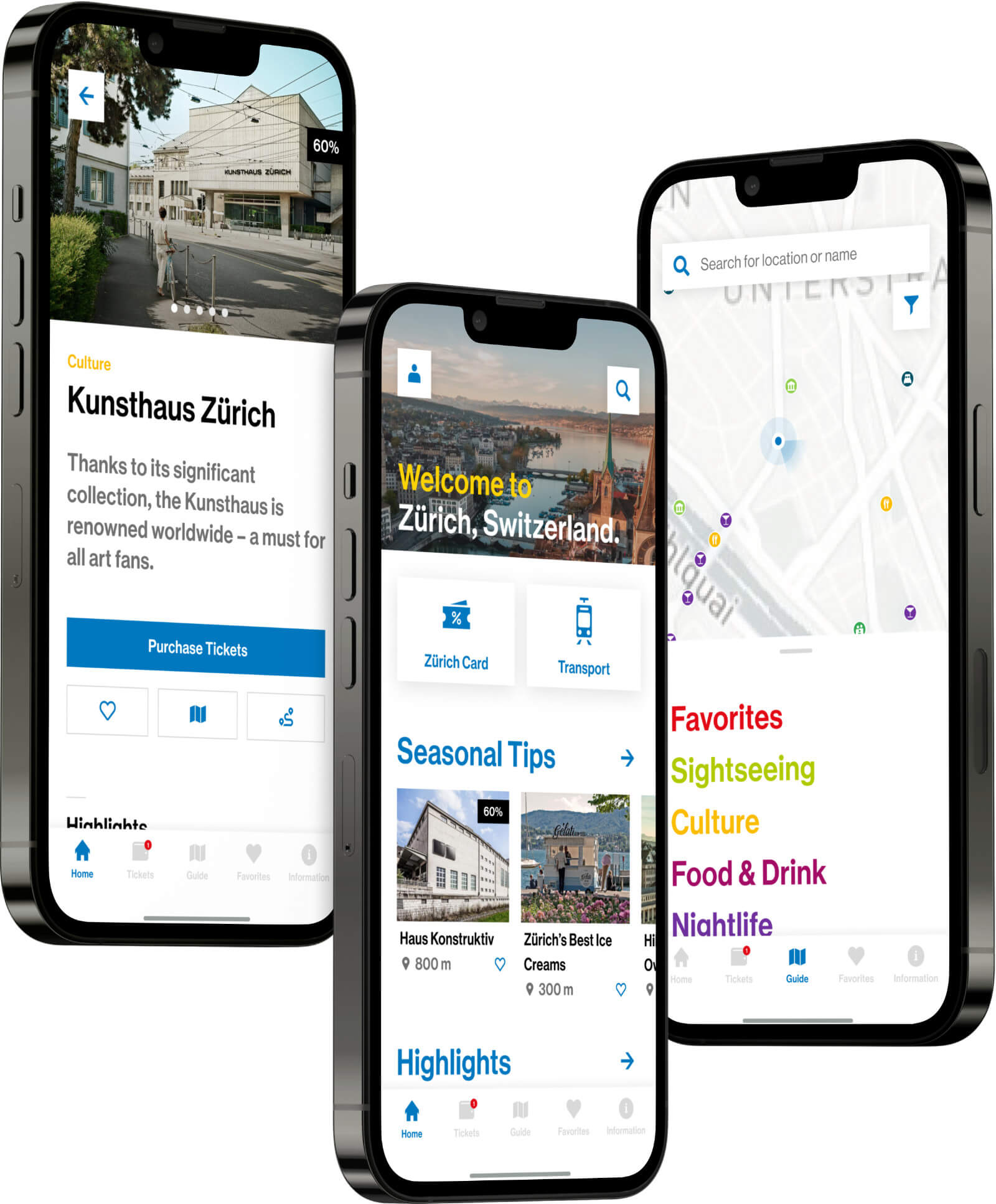
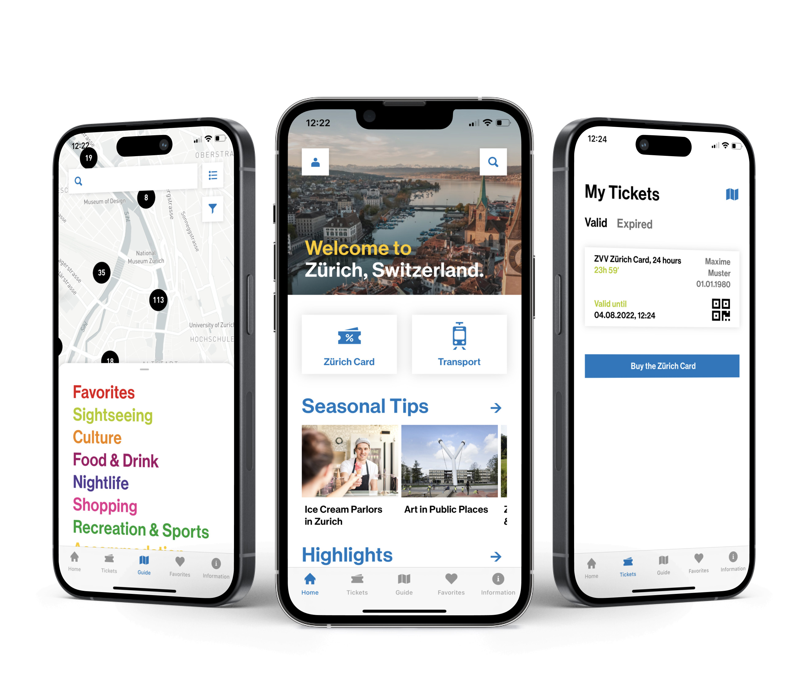
With this navigational revision, we decided to follow common design patterns and introduced a traditional bottom navigation bar. By replacing the unconventional accordion navigation, users could now orient themselves more easily and access key features with one click.
Wireframes
With wireframes we quickly opened the discussion with Zurich Tourismus on how to integrate the Zurich Card and each feature.
The challenge lay in promoting the Zurich Card without being too pushy as to deter locals or users who don't possess one.
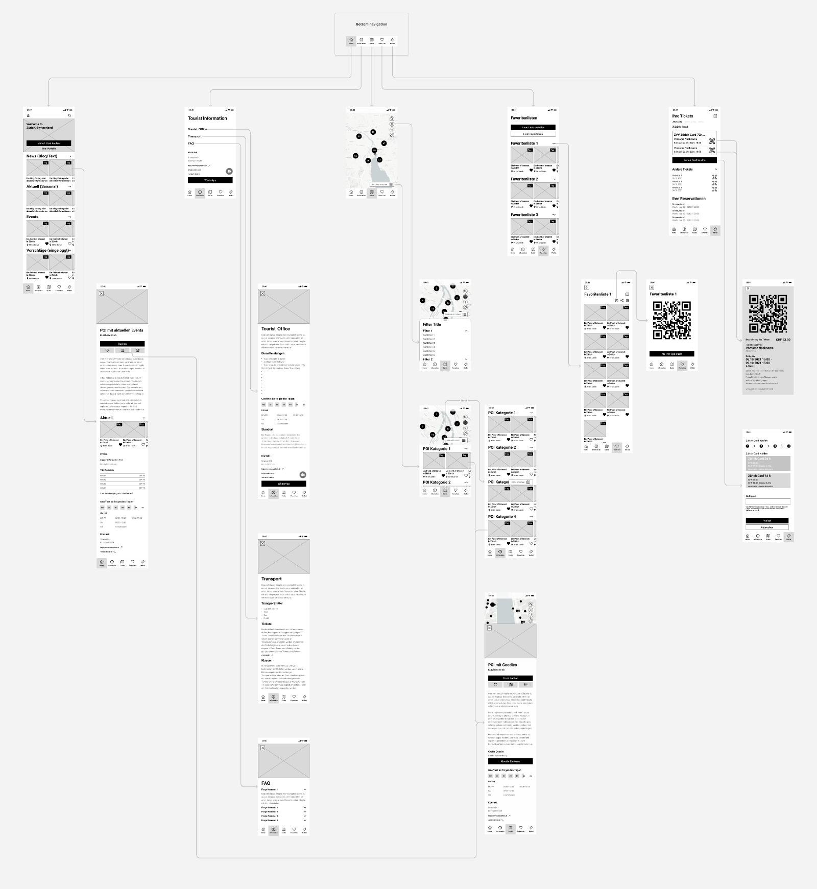
Everyone agreed on not restricting users without a Zurich Card. Instead, indicators are applied, highlighting its benefits and thereby encouraging users in completing a purchase.
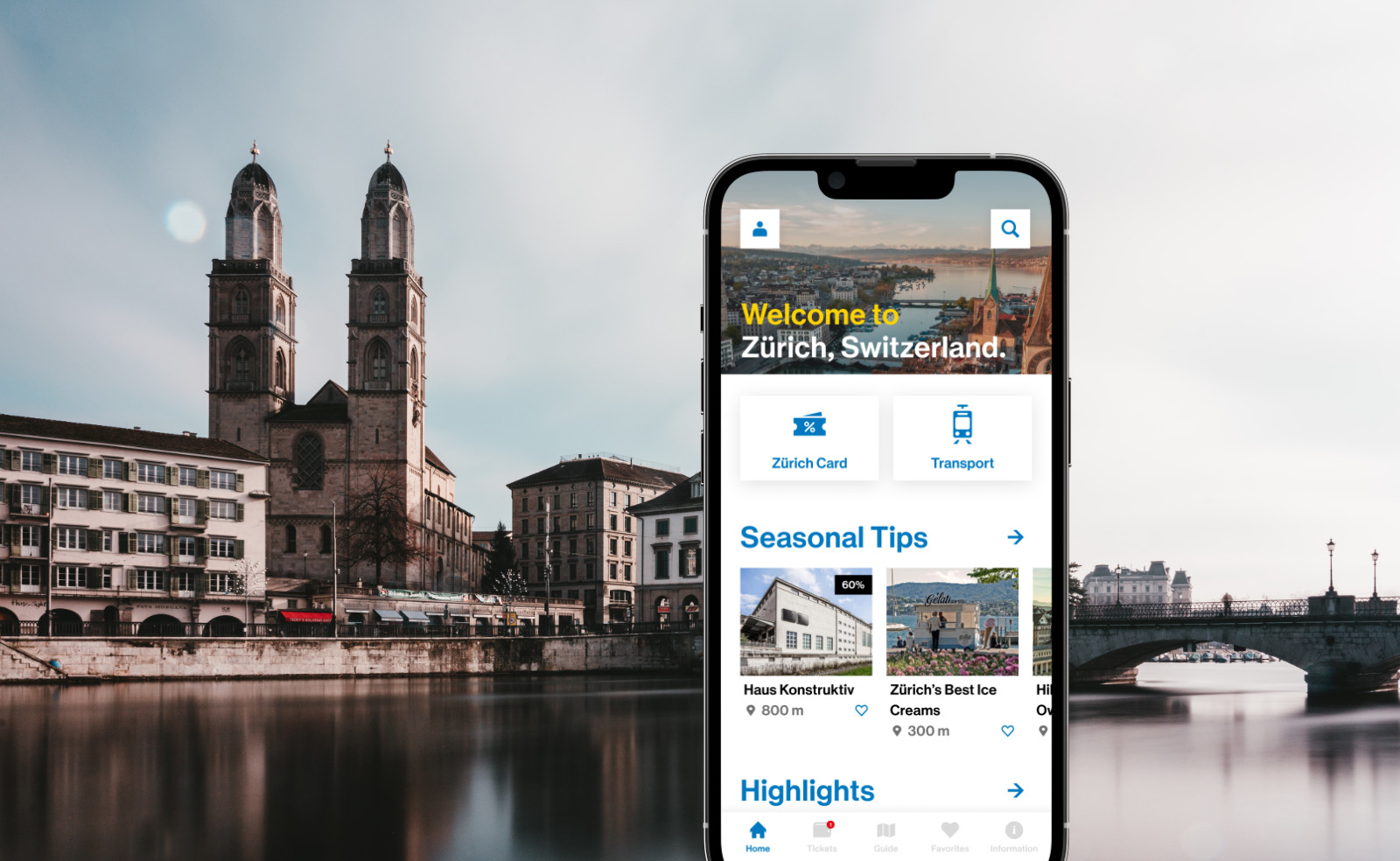
To promote the Zurich Card, CTAs were mostly placed in appropriate contexts, for example in the home screen as an introduction or in the detail pages of points of interests that offered benefits or reductions.
Designs
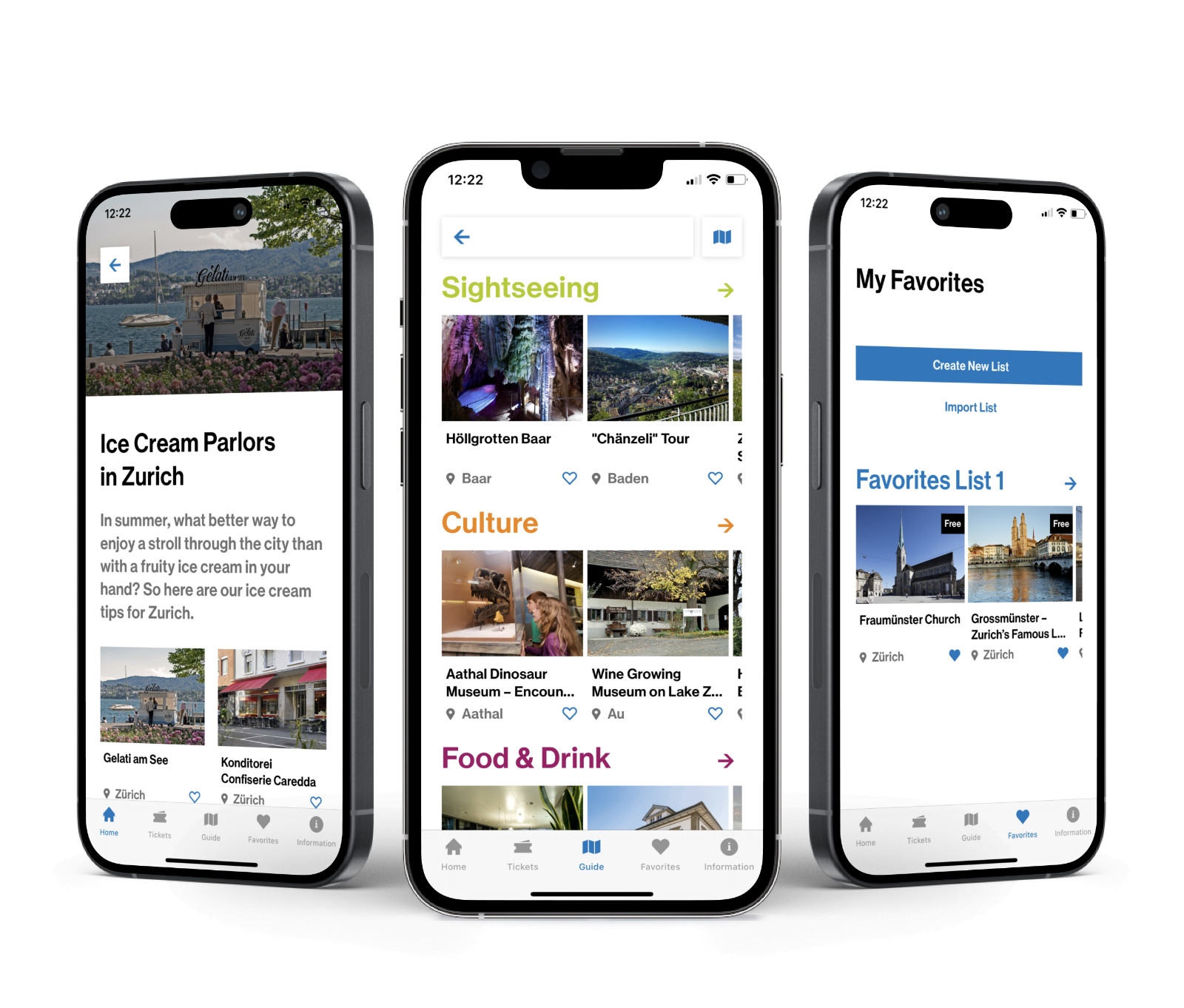
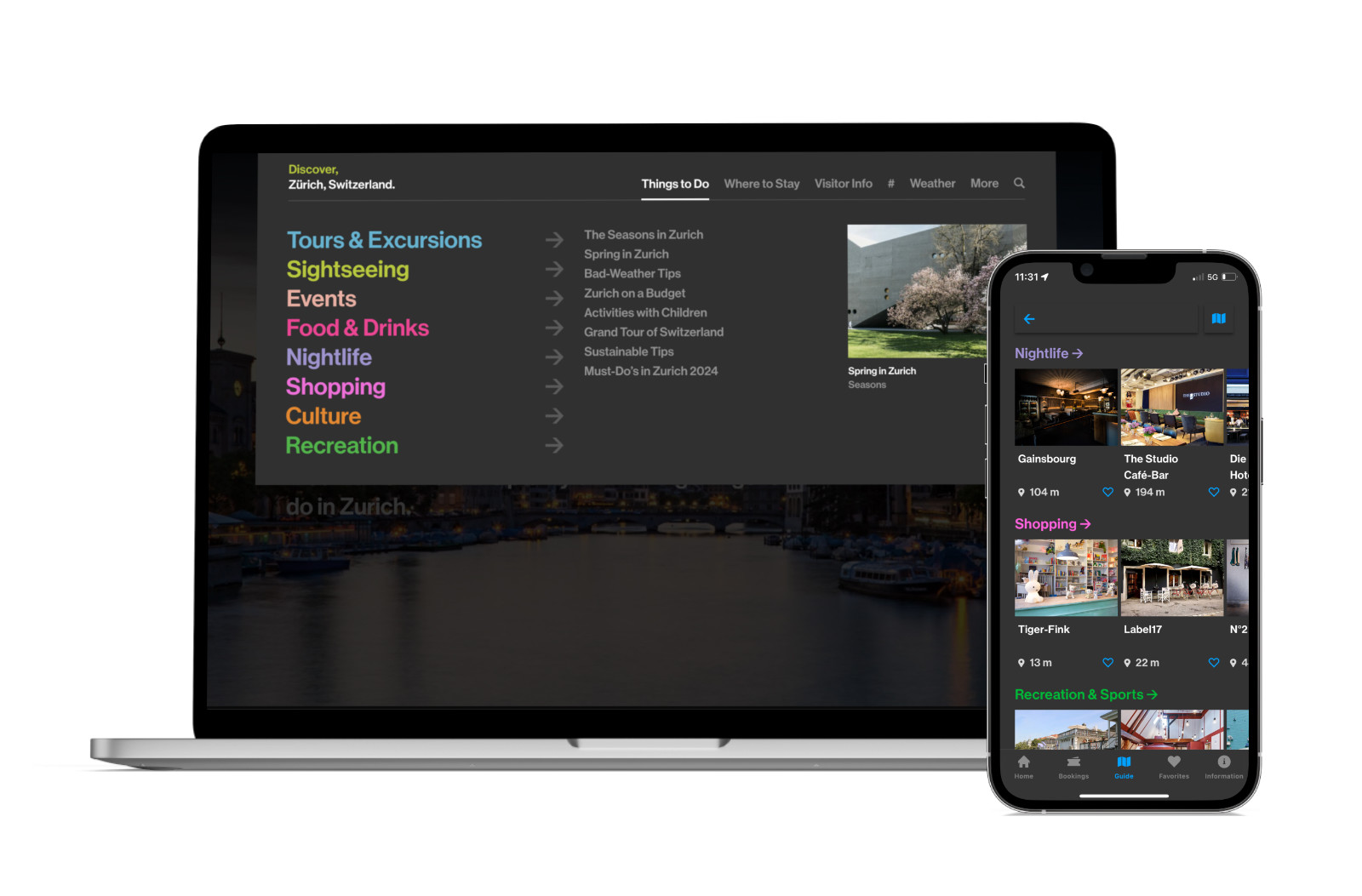
The app's final focus lay in the discovery and sharing of the city's sights, activities and events.
A "favourite listing" feature, allowing users to mark POIs and organise them into groups, targets both tourists and locals: while tourists can make use of it to plan their trip, locals can mark their favourite locations and share it with others.
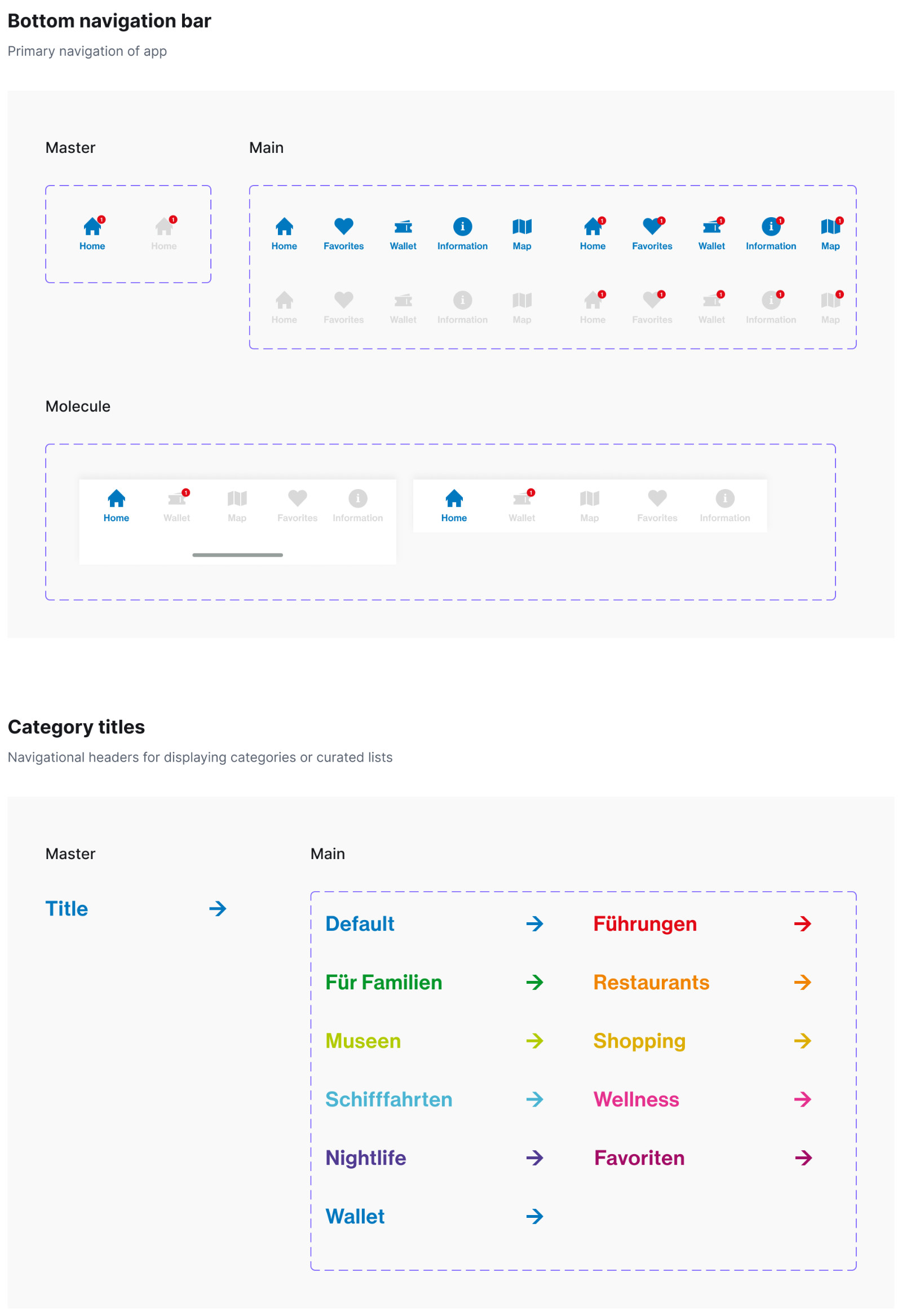
Component Library
To ensure consistency and to scale up production, I was responsible for setting up the component library. It involved respecting the brand’s identity, while rebuilding existing and creating new components.
Using Brad Frost’s Atomic Design, the library was constructed using atoms, molecules, organisms, templates and pages. For atoms and molecules, I often created a master component, making it easier to edit spacing, layout and design across multiple components.
Dark Mode
Zurich Tourismus' brand identity is easily recognisable due to its use of diverse colours for each topic category.
With this new app release, Zurich Tourismus was very keen in releasing a Dark Mode version - a common request from user feedback.
It became our responsibility to map for each Light Mode colour style an equivalent for the Dark Mode. By doing so, we prioritised WCAG conform colours that ensure a good colour contrast.
Light Version (Brand Colours)
Brand
#0078BF
Sky
#4AB4D3
Green
#05962A
Lime
#B1CA00
Yellow
#DDAD02
Orange
#F08400
Red
#FF0000
Pink
#E6308E
Burgundy
#A30D65
Violet
#503A92
Dark Mode
Brand
#00A1FF
4.54:1
Sky
#B4E4E8
9.15:1
Green
#00B837
4.74:1
Lime
#92D050
6.83:1
Yellow
#FFFF00
11.77:1
Orange
#FBBC04
7.40:1
Red
#FF6B6B
4.56:1
Pink
#FF61DD
4.81:1
Rose
#F2AC9F
6.72:1
Violet
#A292D3
4.57:1
Dark Mode Neutral Colours
Black
#333333
Dark Gray
#414141
Gray
#707070
Light Gray
#E6E6E6
White
#FFFFFF
These Dark Mode colours were later added to Zurich Tourismus' brand style guide and implemented into their website.
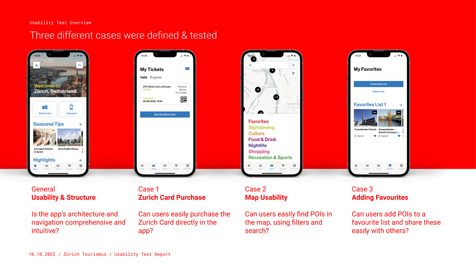
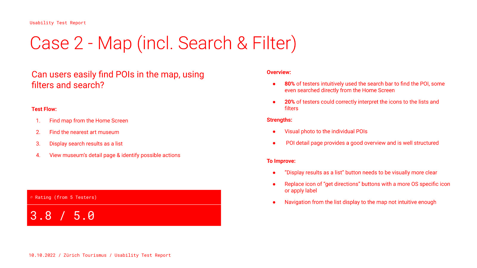
Usability Tests
To investigate the full user experience with actual tourists, we conducted a usability test over a period of two days. To reach the right target audience, we resorted to guerilla testing.
Guerilla Testing
The usability testers were recruited on-site at the tourist office located in Zurich's main train station (Zurich HB).
Two observers participated in the usability test: a moderator who conducted the interview (myself) and a notetaker who recorded the feedback and observations. We definedthree test cases in advance and tested each with 5 users.
Statistics
- Participants: 15
- Average age: 36 years
- Gender distribution: 8 men; 7 women
- Most named countries of origin: 27% USA; 13% Germany
The results were documented in a usability test report, including suggestions as to how we can improve the app in a future iteration.
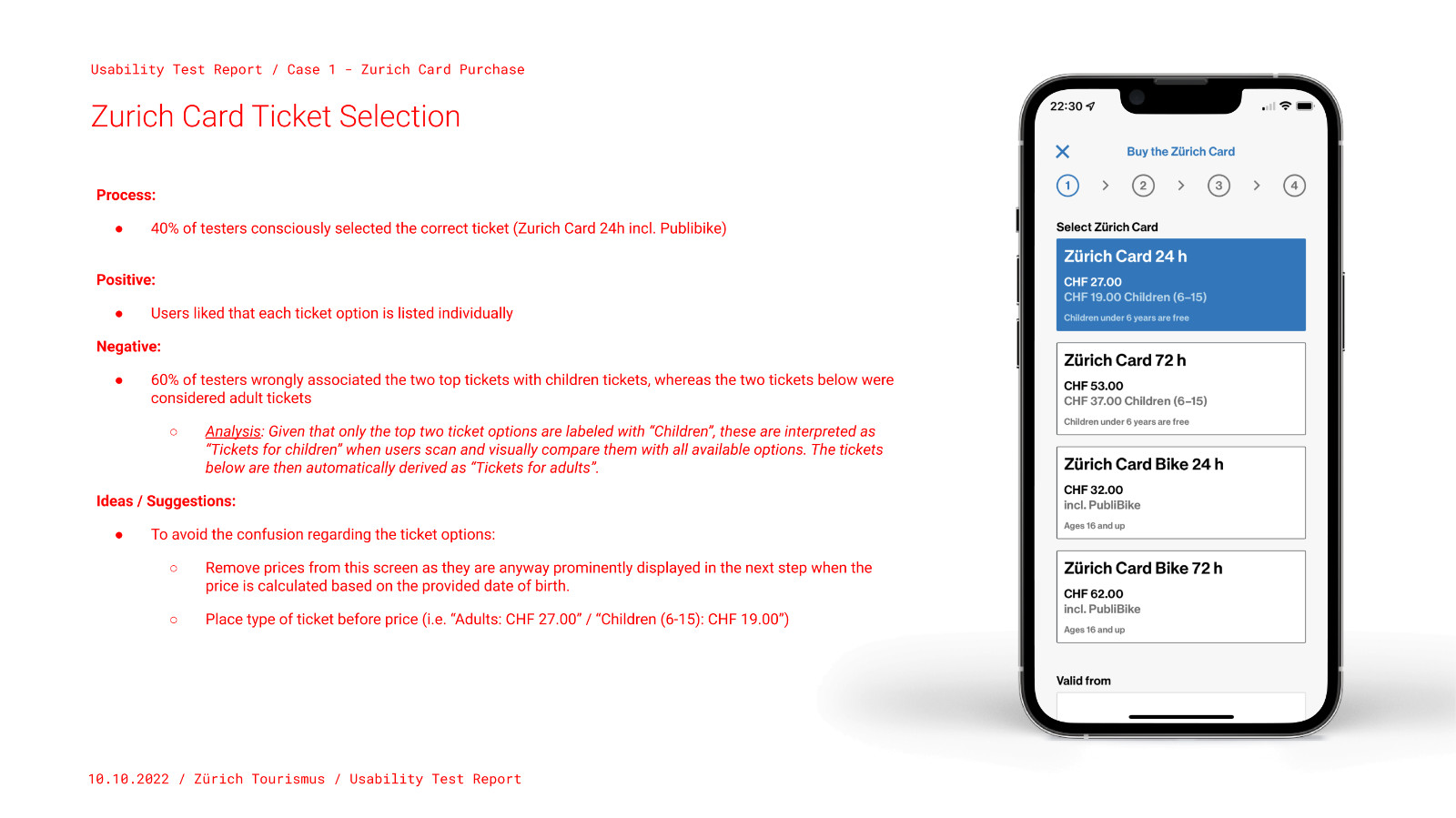
Key Insights
- Simple design & structure:
The design was generally described as "simple", "clean", and "welcoming". The app was perceived as well structured and intuitive. - More travel information:
Testers expressed the need of having more travel information (e.g.: zones; airport commute). - Confusing labelling:
Finding the purchased tickets was tricky due to the tab’s “Wallet” label. This metaphor was more associated to money than to tickets or travel cards.
Conclusion
Today, the app proudly holds a 4.9 rating on the App Store, reflecting its positive user experience.
Central to this great reception is our comprehensive design component library. Beyond facilitating collaboration and efficient handover between developers and other designers, it also promoted quality, coherence and brand identity, reaffirming its invaluable use in design.
Traveling through Zurich today, it is extremely fulfilling to spot the app being promoted in various public spaces, from airports to train stations. This serves as a reminder of design's real-world impact and how it can reach such diverse audiences.
Looking forward, the partnership between Formatfrei and Zurich Tourismus remains strong, with plans for ongoing updates and new features. As we continue to refine the app, our focus remains on delivering an excellent user experience while supporting Zurich Tourismus in their vision of creating the best digital city companion for Zurich.